Color Study for Penelope's Canvas
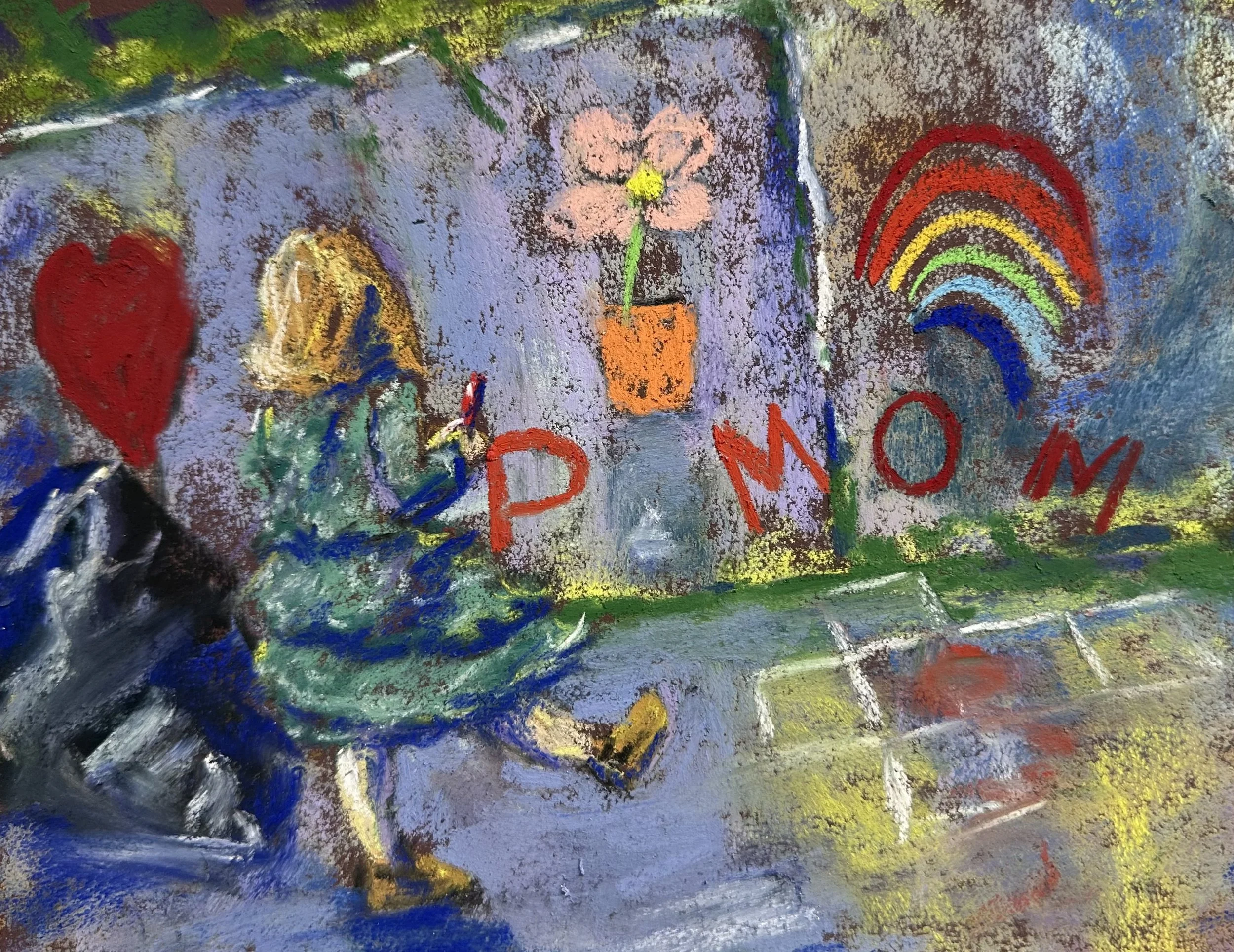
We have a large concrete retaining wall out front that our daughters draw on with chalk often. I’m thinking of doing a large version of this painting at some point. I think that the dress and its movement were what got my attention initially, but I tried to capture the color of it and, as a result, I think the cool green of the dress and the coolness of the concrete although harmonizing has pulled her too far into the painting. I really like the texture of the paper here. It’s done a lot of work to make this feel like concrete. The trashbag on the left is more or less a confusing lump, and I’m not a “trash” painter so I’m not sure why I even included it except that I wanted some dark shapes in the foreground to lead the viewer in. I’ll not likely paint the trash into the final, larger painting. I like the sheerness of the dress sleeves, but it was tough to do much overglazing at this size on the arm just due to the size of the pastels I’m using, so I’ll play with that on the bigger patinging maybe. I do think it looks mostly fine a it is and it was less important to the overall image anyway. What will likely happen is that I’ll change the lighting a bit so that she casts a shadow onto the ground in front of her, and then I will also try and get some branches from the little bushes on top of the wall that cut across the concrete to create a bit more depth. And then I’ll instensify the warmth of the pink in the potted flower and have it overlap the figure. The hop scotch is out of walk because I didn’t draw it in perspective; I was in a hurry so it was more important to get the idea down than to execute it correctly.