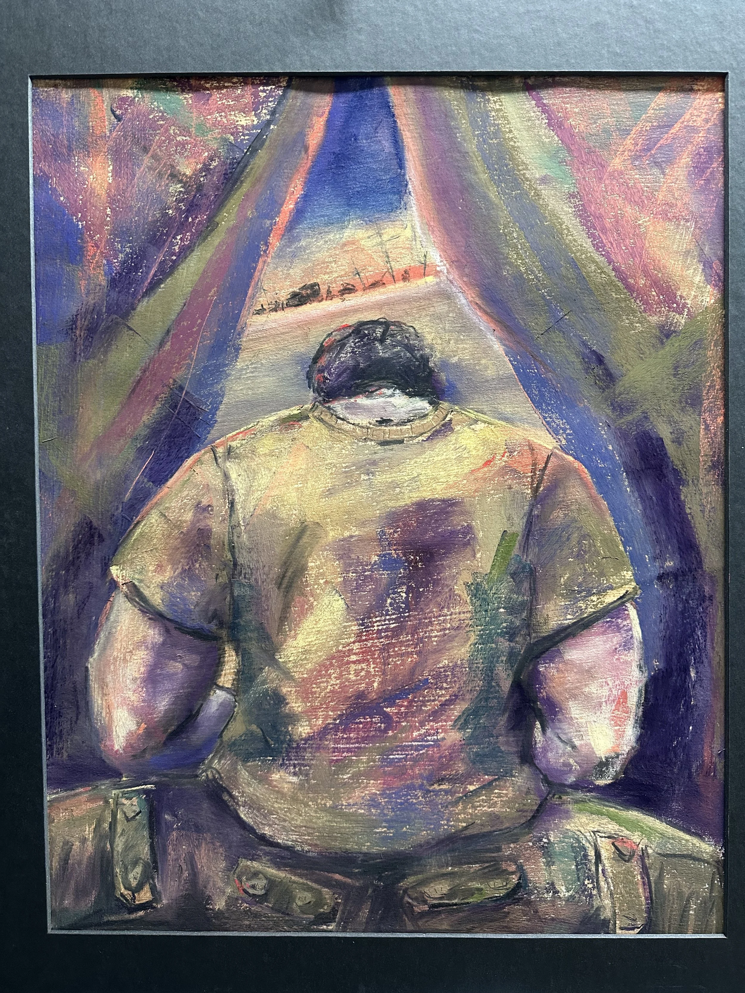
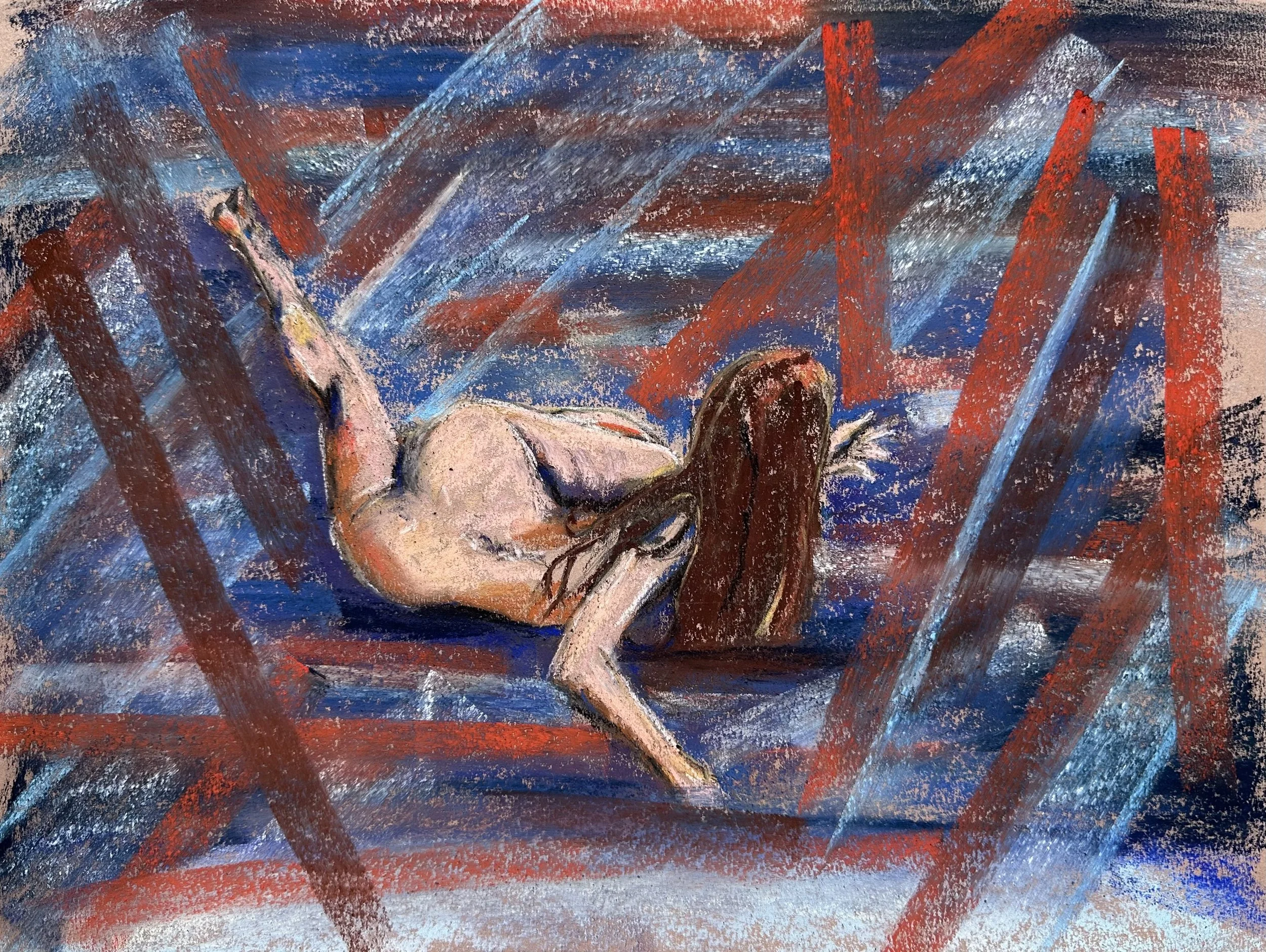
Tent City, Prince Sultan Air Base Will Show at Around the Bend 2026
This year for Around the Bend at the South Bend Museum of Art my painting of an airman in tent city for the pre-invasion of Iraq in 2003 will be on display with a wide array of art from other local artists. I’m grateful to the jurors for including it. The painting is 18x24 pastel on paper.
Inventing for Composition
After talking with a couple fellow Northern Indiana Pastel Society members today about developing style, I thought about my talk and then decided to add this post as a supplement in case it might be helpful for anyone else. I do believe style is kind of just “what you do” and that becomes more distinct the more you work, and I also believe that forcing a style onto your work might actually hinder growth as an artist, but to get down to it, I’ll just start.
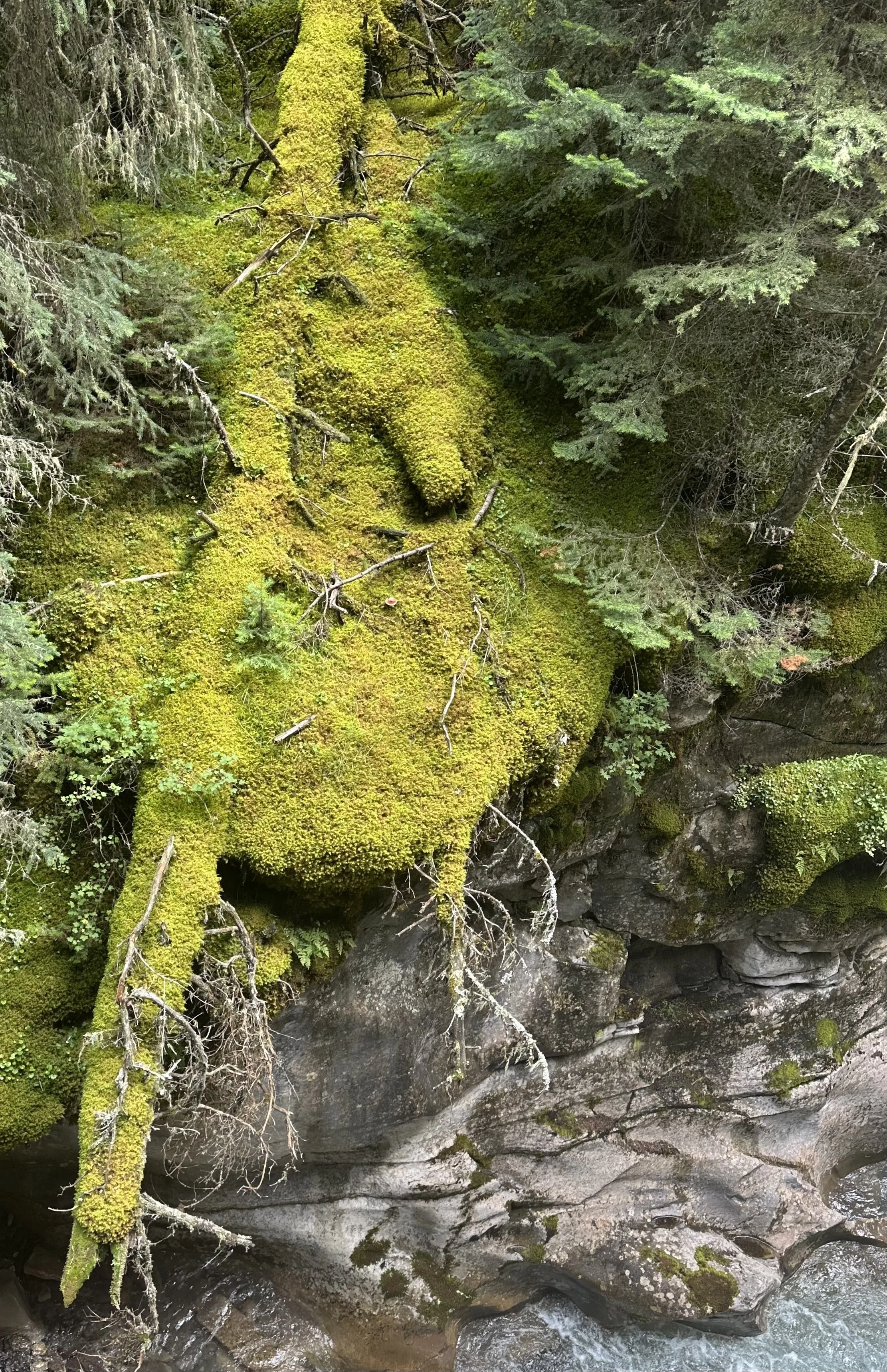
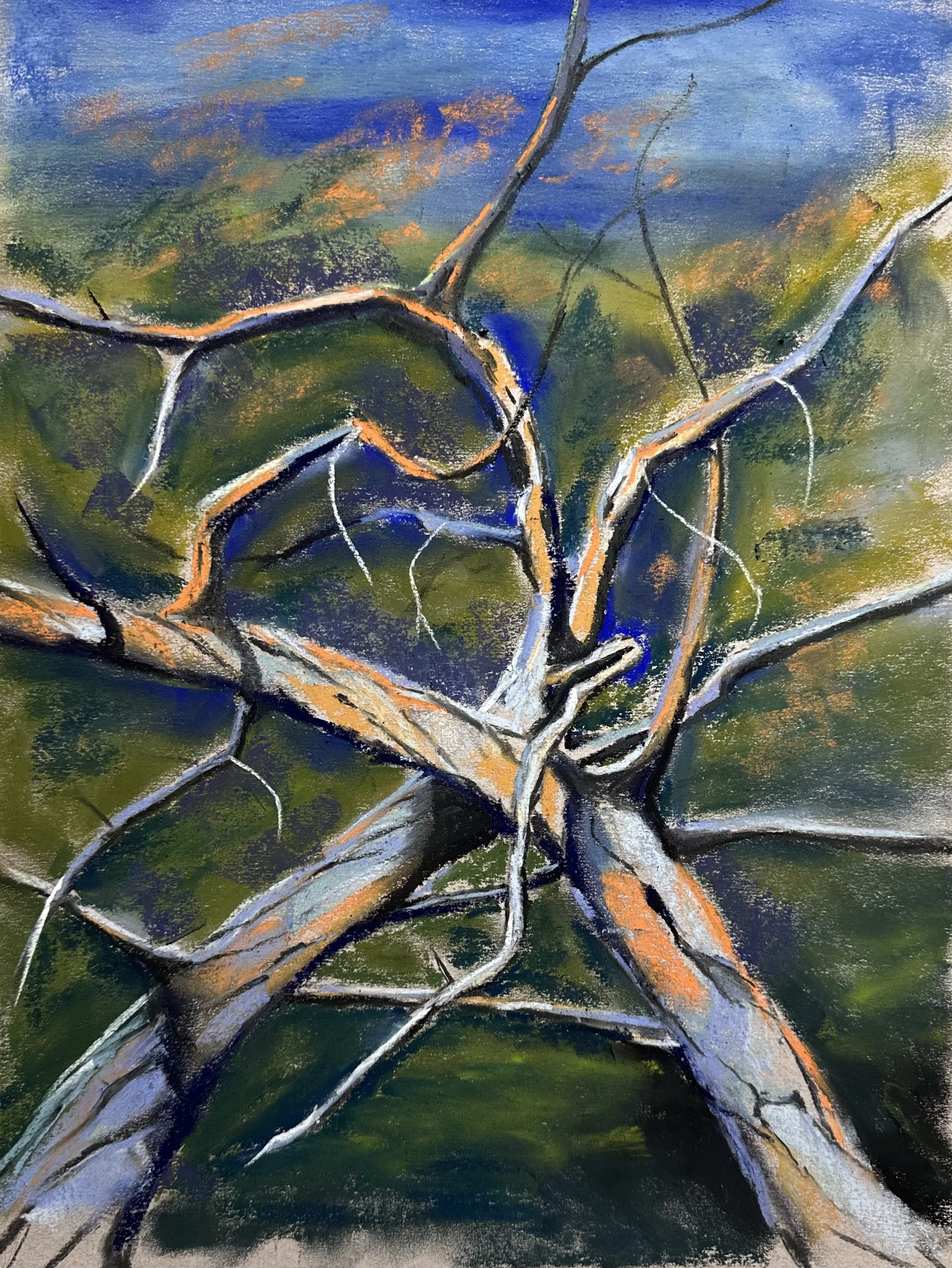
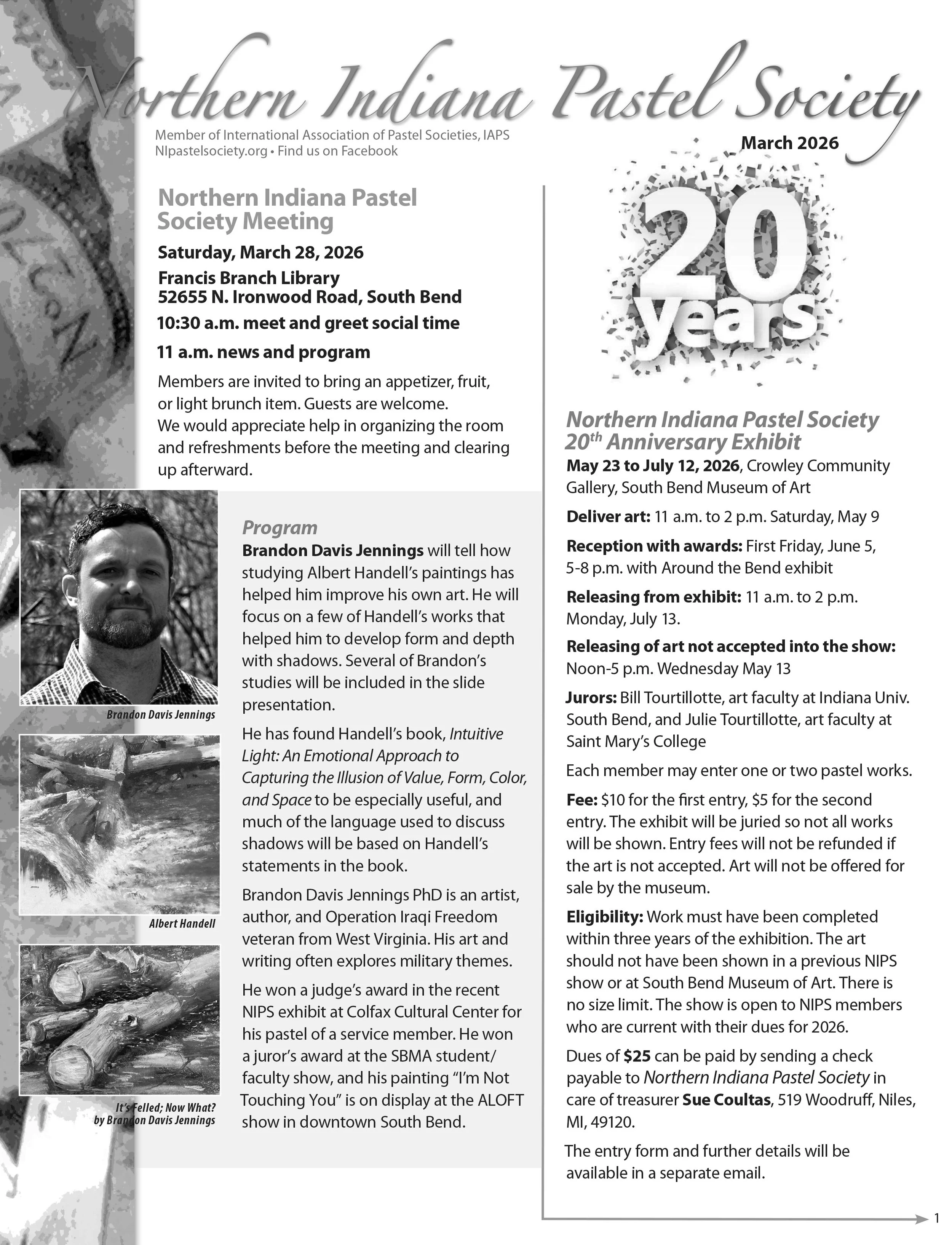
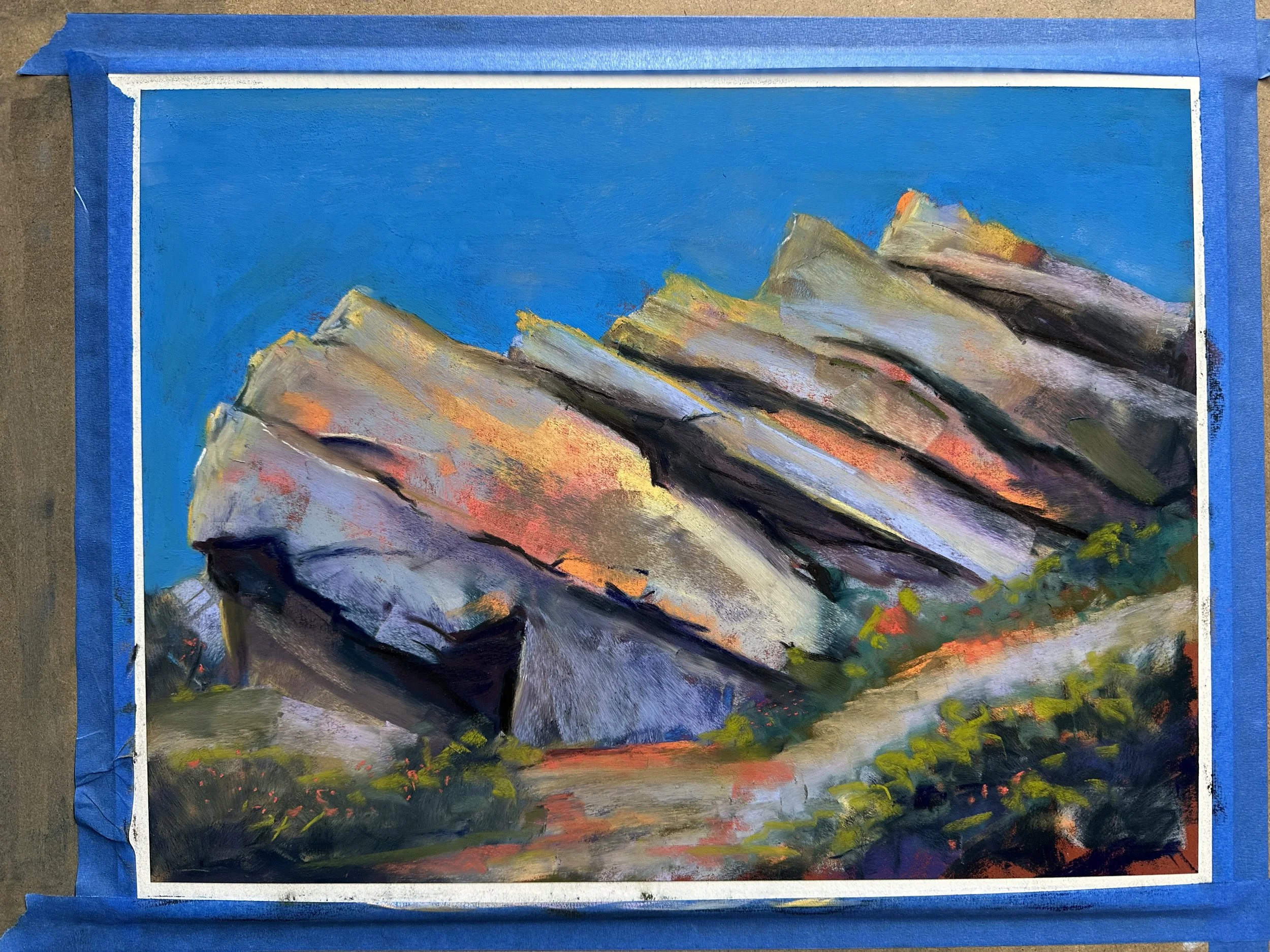
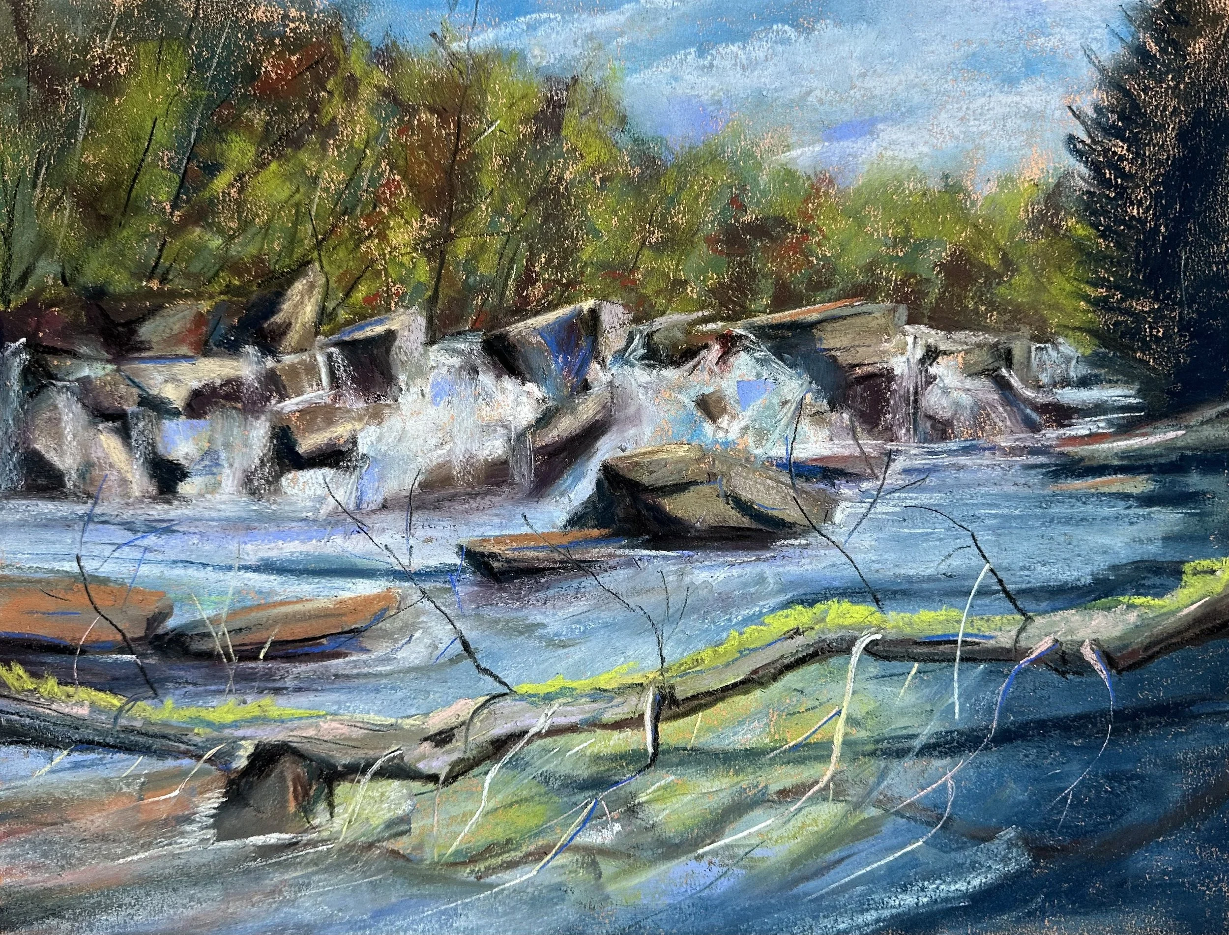
This is a photo from Alberta Canada that I took last summer. I wanted to paint it because the greens in the moss were so vibrant and the fact that the tree was becoming “one with the rock” was also really interesting to me. Knowing that during most of the winter this brilliant color was just buried in snow also excited me because I “got to see it” and not everyone could see it all the time. But I put off painting it because I didn’t think it would make a very interesting painting.
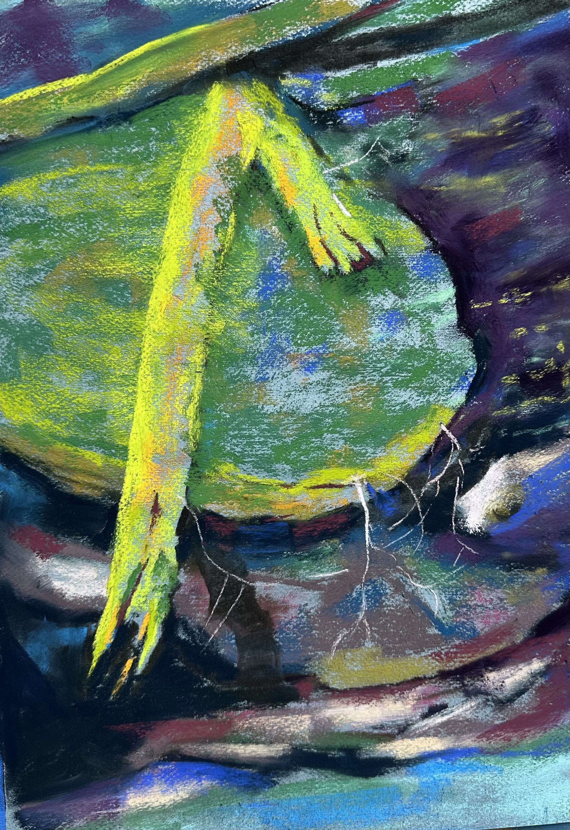
This was my first pass at the painting. As you can see, there is plenty of green. And the general idea is there, but it is not very dynamic. But the photo isn’t very dynamic either. So what do I do? I can’t go back to Alberta and try again with the photo. So I thought, maybe I need to invent something to create a more interesting composition.
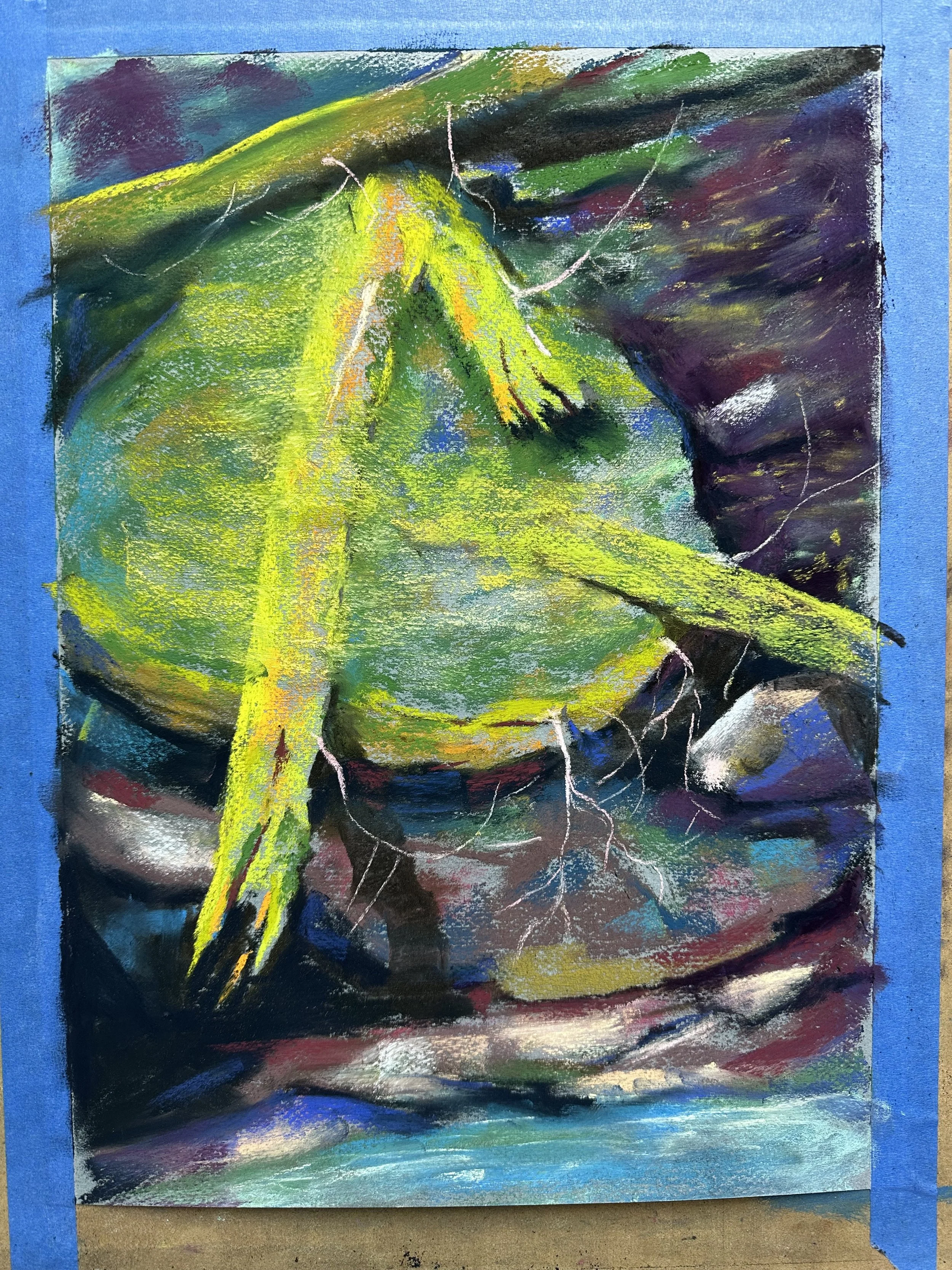
How I did that was by bringing another log onto the scene. This helped to guide the viewer’s eye into the painting from the right side, and it also created a little variety in the shape in the middle of the image where all that green is hanging around. But was that enough? I didn’t think so.
Rather than worry about what would happen to all that green in the middle if I painted over it, I just took that log and made it travel the length of the painting so that it had a chance to cast more shadows and create more contrast over the otherwise flat, green, mossy rock. But was that enough?
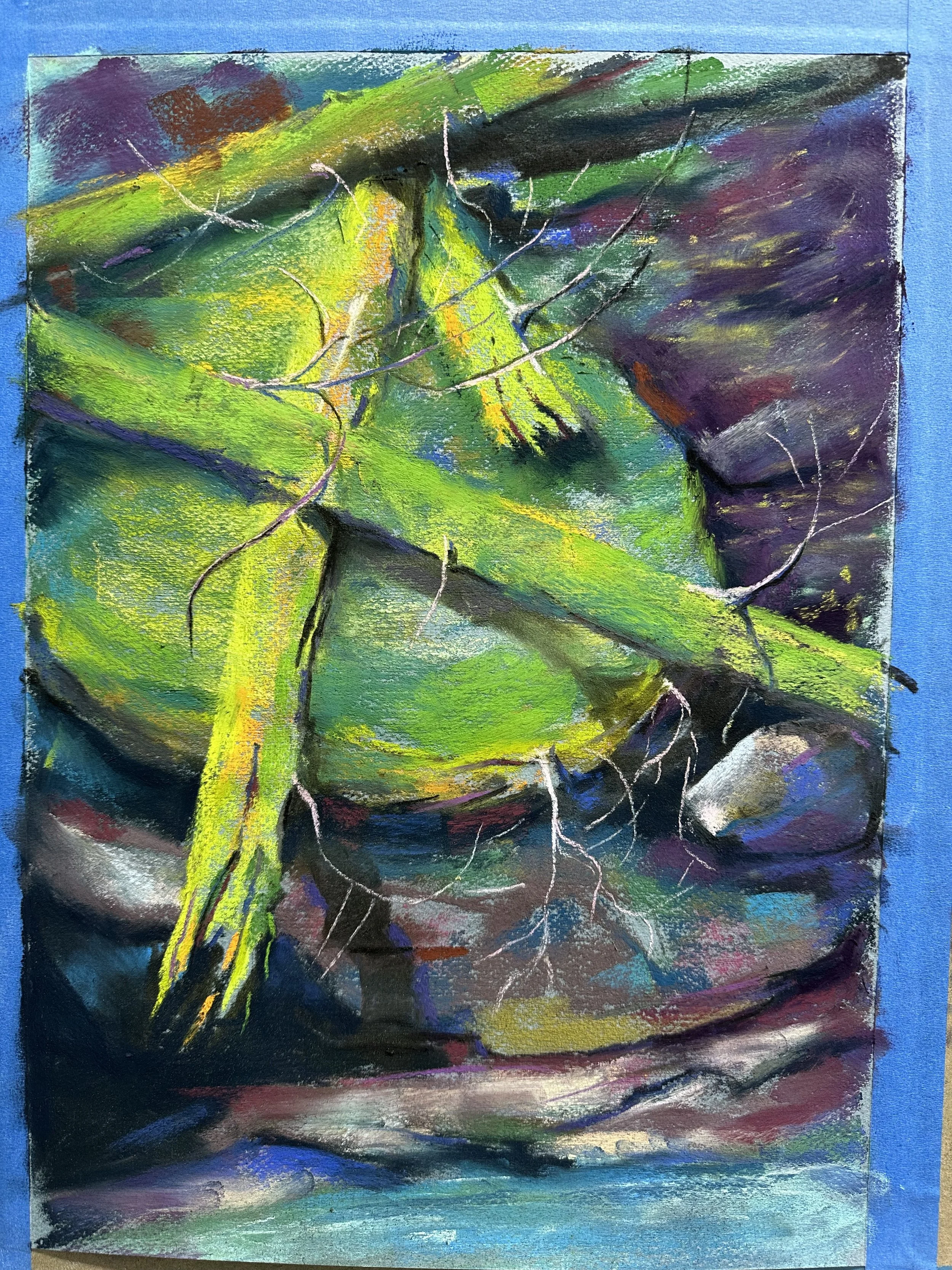
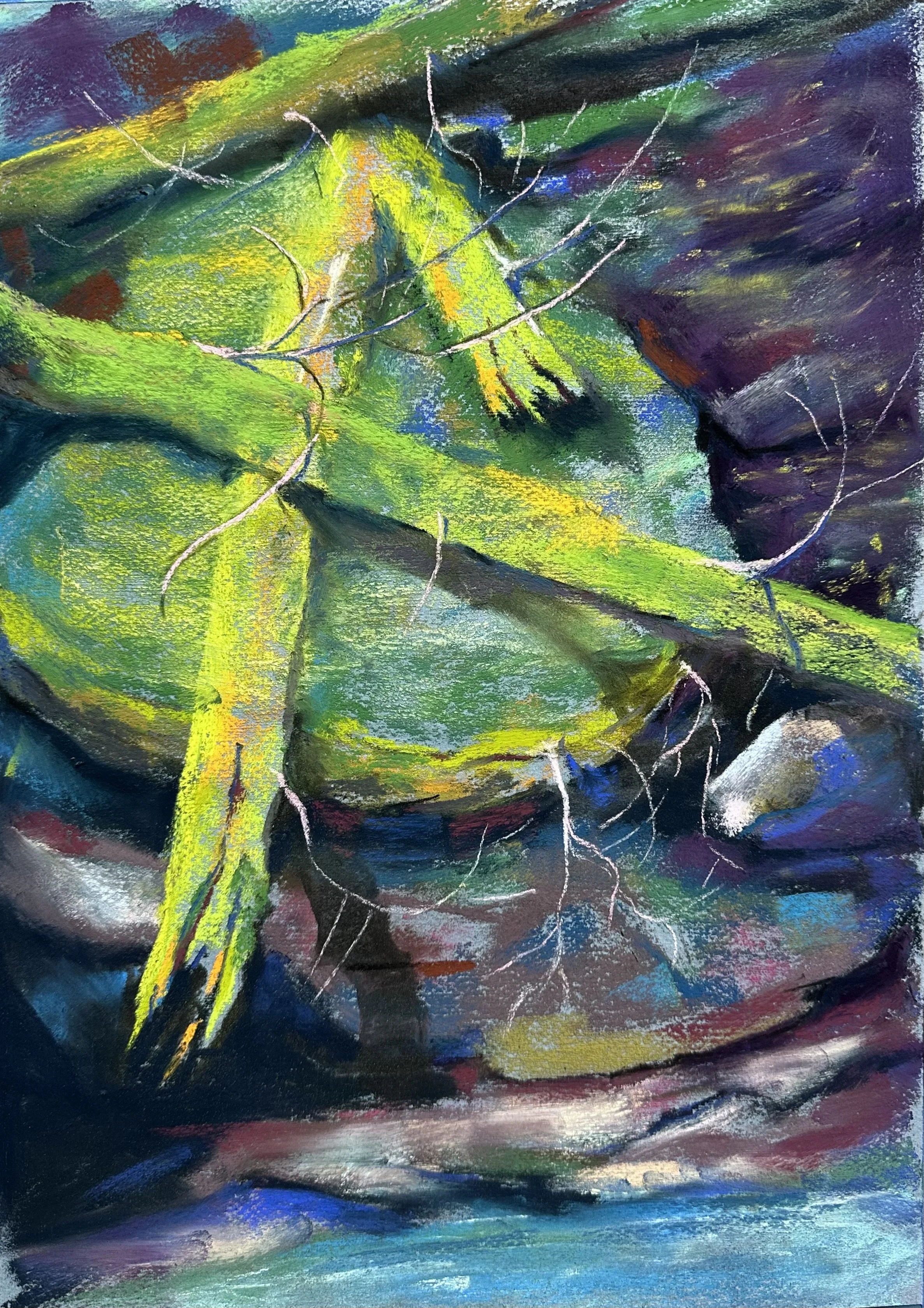
I didn’t really do much here aside from adding some roots and branches with sweeping curves to create some shape contrast in response to the hard edges of the rocks. But what I do think is that in this series of images you can see from the reference that even though I loved seeing that mossy tree on that rock in Canada, I did not feel that I must represent exactly what I saw for the painting to be a good one. I do think that the likeness is extremely important in portraiture, but when it comes to things like this, it’s best not to let the facts get in the way of something that may be more beautiful.
Art Talk This Saturday
I am giving a short art talk on pastel painting this Saturday at the Francis Branch Library in South Bend. This is for the Northern Indiana Pastel Society (of which I am a member). The event begins at 10:30, and my talk will start at around 11:00 and last around 20 minutes. Guests are welcome, and any of the other members would be happy to meet folks interested in pastels or painting. Feel free to come by and say hello. Thank you to Cathy McCormick for putting this all together.
Here is the flier:
Some New Stuff
I’ve been very busy with life stuff on top of a few writing projects that got me a bit off schedule with the blog. But here is a smattering of the painting I’ve been working on during the past few months.
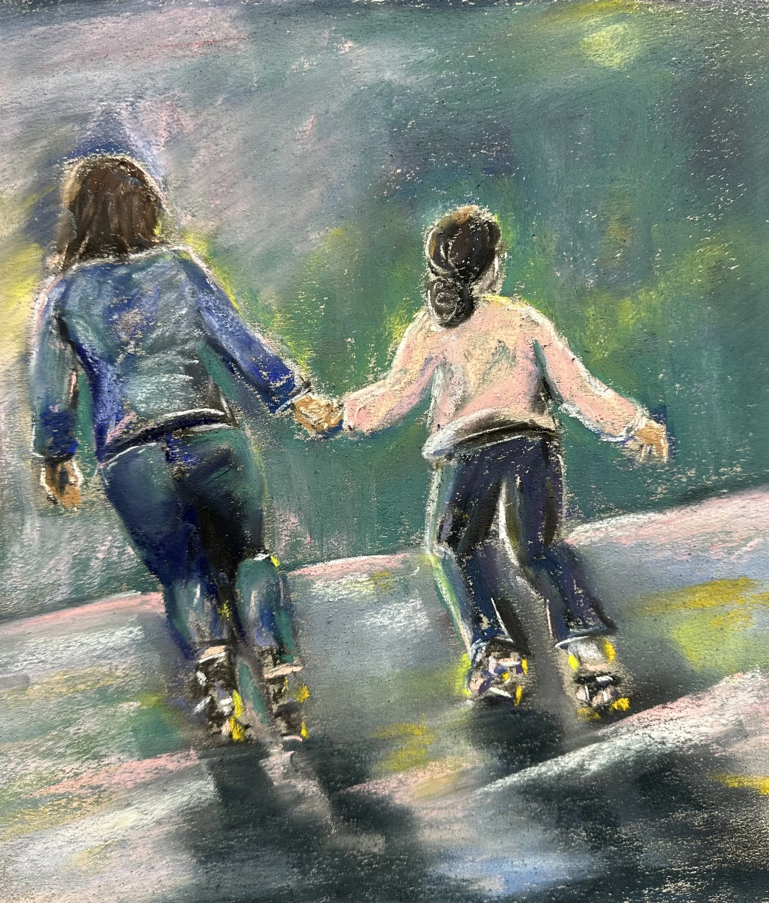
Galaxy Roller Rink
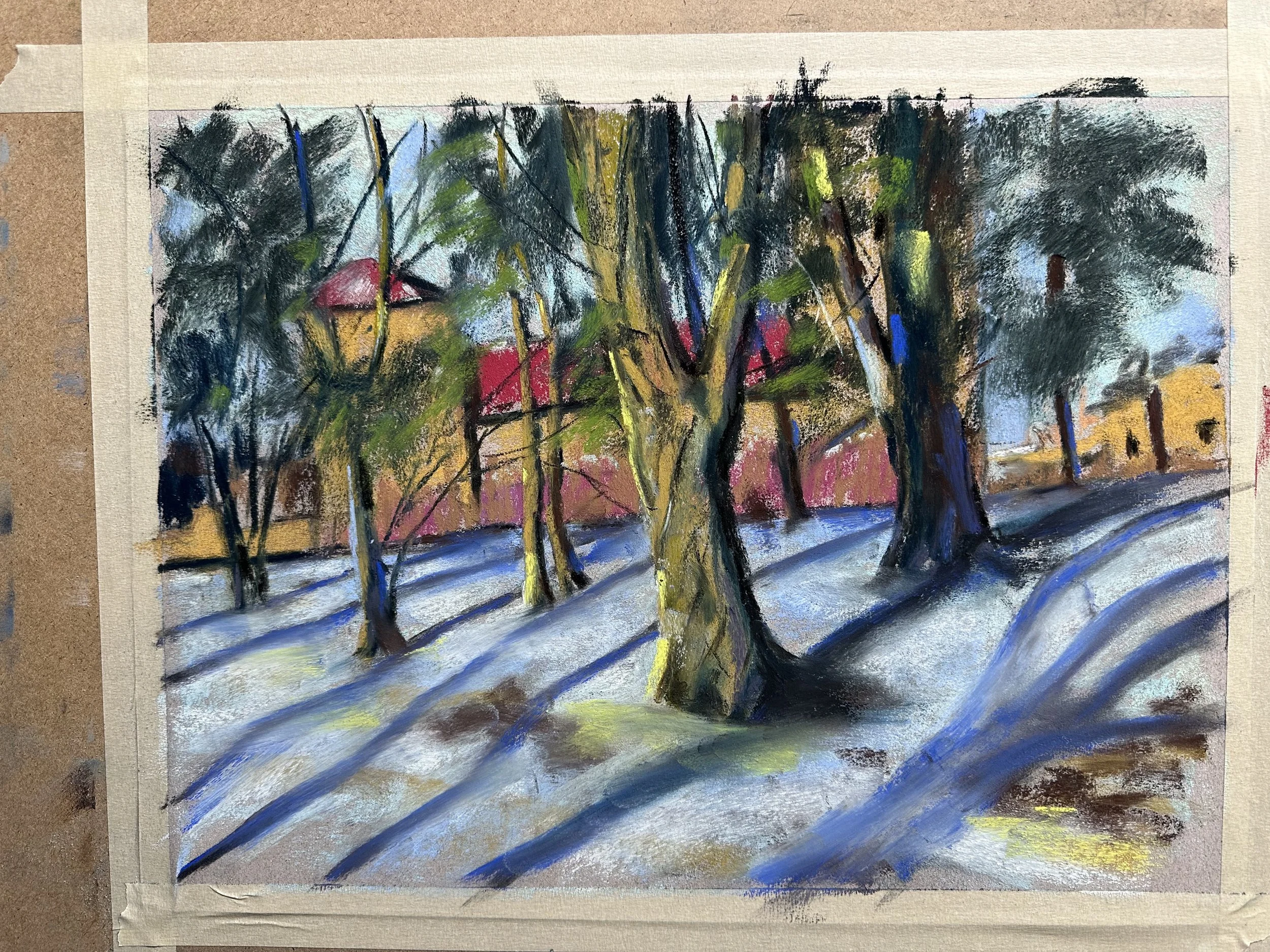
Here’s a pastel of mom and daughter skating together. I was going to do a vignette, but then I started wanting to do a pink/green contrast thing. I started with a green that was too warm. So I cooled it down and I think how loose it is has captured the movement and the light of that moment. If I’d left it as a vignette then I’d feel less compelled to get the far wall into the painting than I am currently. But the size of the painting lends itself to something less rendered. It’s pretty enough as it stands anyway.
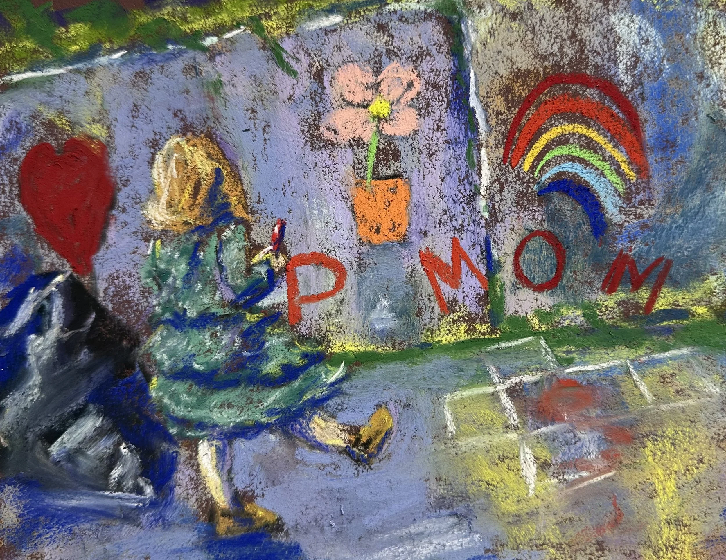
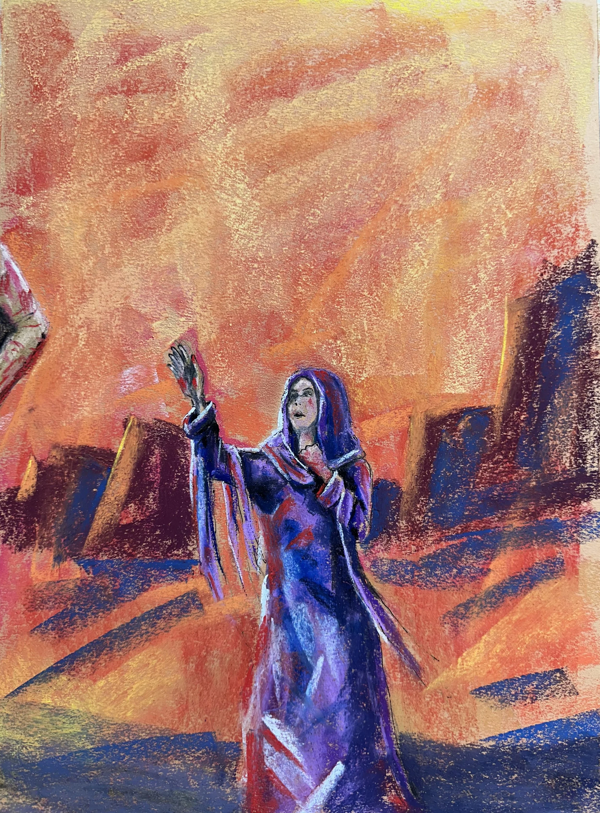
Color Study for Penelope's Canvas
We have a large concrete retaining wall out front that our daughters draw on with chalk often. I’m thinking of doing a large version of this painting at some point. I think that the dress and its movement were what got my attention initially, but I tried to capture the color of it and, as a result, I think the cool green of the dress and the coolness of the concrete although harmonizing has pulled her too far into the painting. I really like the texture of the paper here. It’s done a lot of work to make this feel like concrete. The trashbag on the left is more or less a confusing lump, and I’m not a “trash” painter so I’m not sure why I even included it except that I wanted some dark shapes in the foreground to lead the viewer in. I’ll not likely paint the trash into the final, larger painting. I like the sheerness of the dress sleeves, but it was tough to do much overglazing at this size on the arm just due to the size of the pastels I’m using, so I’ll play with that on the bigger patinging maybe. I do think it looks mostly fine a it is and it was less important to the overall image anyway. What will likely happen is that I’ll change the lighting a bit so that she casts a shadow onto the ground in front of her, and then I will also try and get some branches from the little bushes on top of the wall that cut across the concrete to create a bit more depth. And then I’ll instensify the warmth of the pink in the potted flower and have it overlap the figure. The hop scotch is out of walk because I didn’t draw it in perspective; I was in a hurry so it was more important to get the idea down than to execute it correctly.
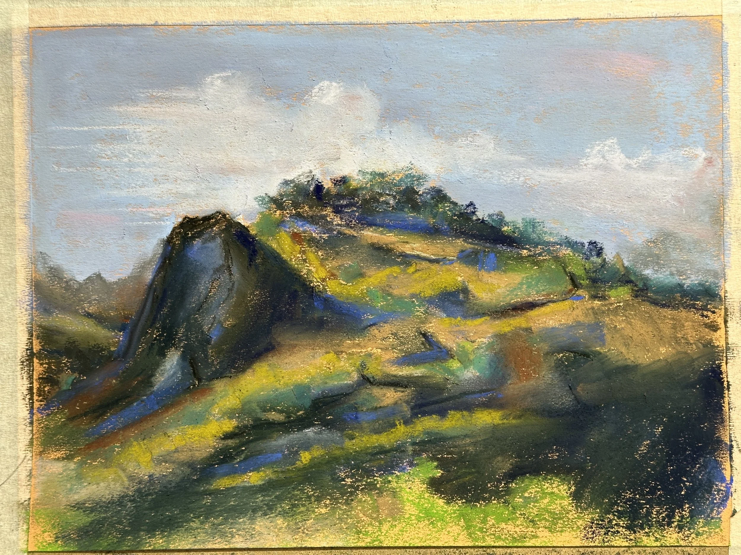
Albert Handell Study
I don’t paint a lot of architecture, and I’m starting to get tired of just painting dead trees, so I’m looking to Albert Handell for inspiration again. This is a study done from his painting “The Scottish Rite Temple.” In his book Intuitive Light, Handell shows this painting while talking about shadows and how they are affected by light in various situations. I’m currently working on a talk for this subject to give to the Northern Indiana Pastel Society at some point in January or February of 2026. I don’t plan to make this a finished painting (it’s not really my composition), but this was a helpful exercise to see what he did with the shadows in various places. One of the things that is notably different between his original and mine is that the ground plan in mine is much curvier, and part of the reason is that I took a photo of painting and the page was curved. It affected the way I painted the cast shadows of the trees outside the frame and I hadn’t even intended for that to happen. He also painted on sanded board, and I did this on mi-teinte paper that I put a coat of gessoe on in order to give it some more tooth. I do this sometimes now in order to use the mi-teinte paper rather than do studies on my better papers while still getting a rougher surface to work on. I have found that the gessoed surface doesn’t really take the Diane Townsend terrages very well, and that it eats up my Terry Ludwigs too. The unisons I use on the gessoed surface work great and so do my rembrandts (those are my workhorses currently, and I’ve been pleased with them).
The holiday season is coming up, so I am gong to start cranking out some 5x7s.
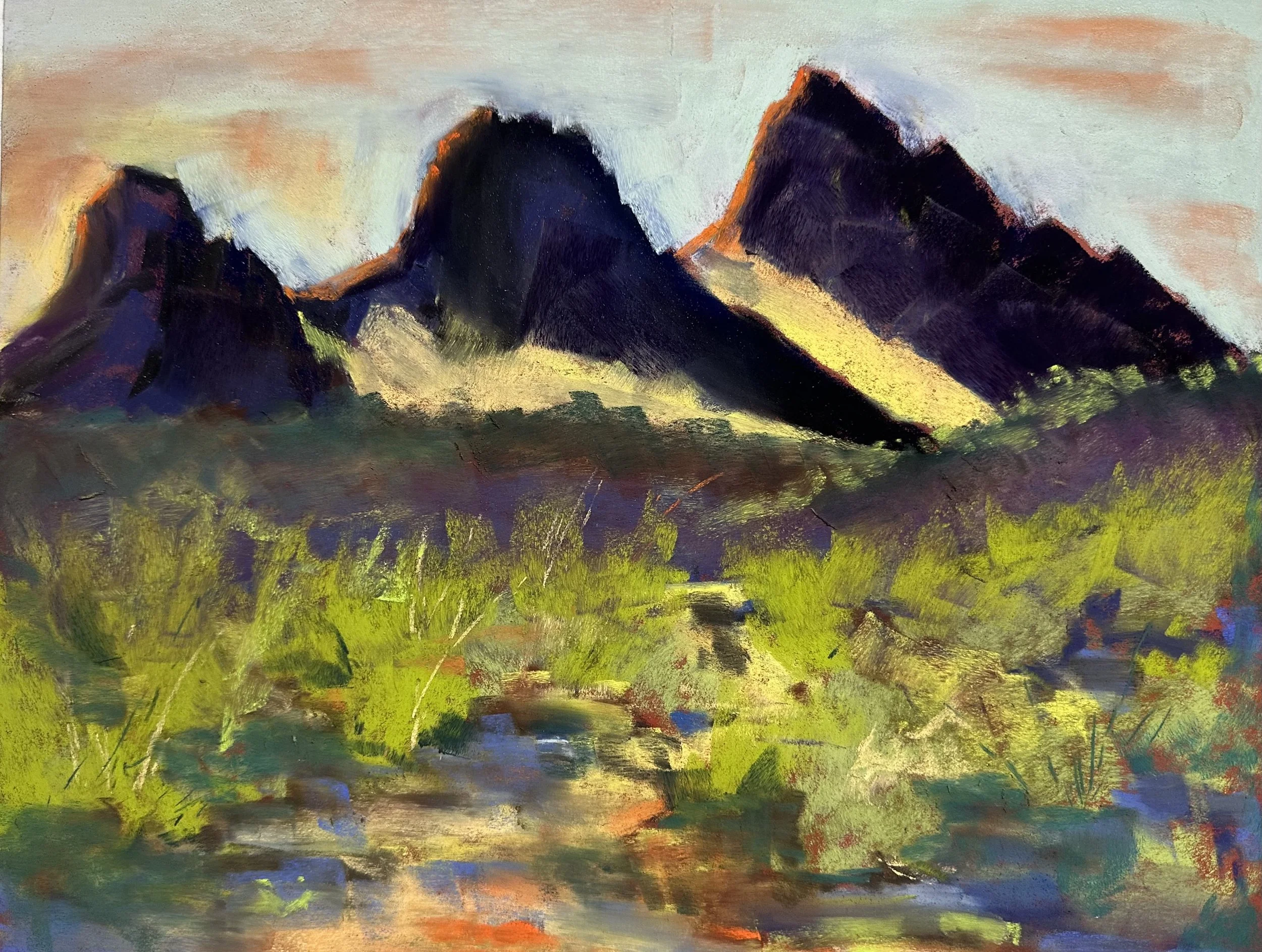
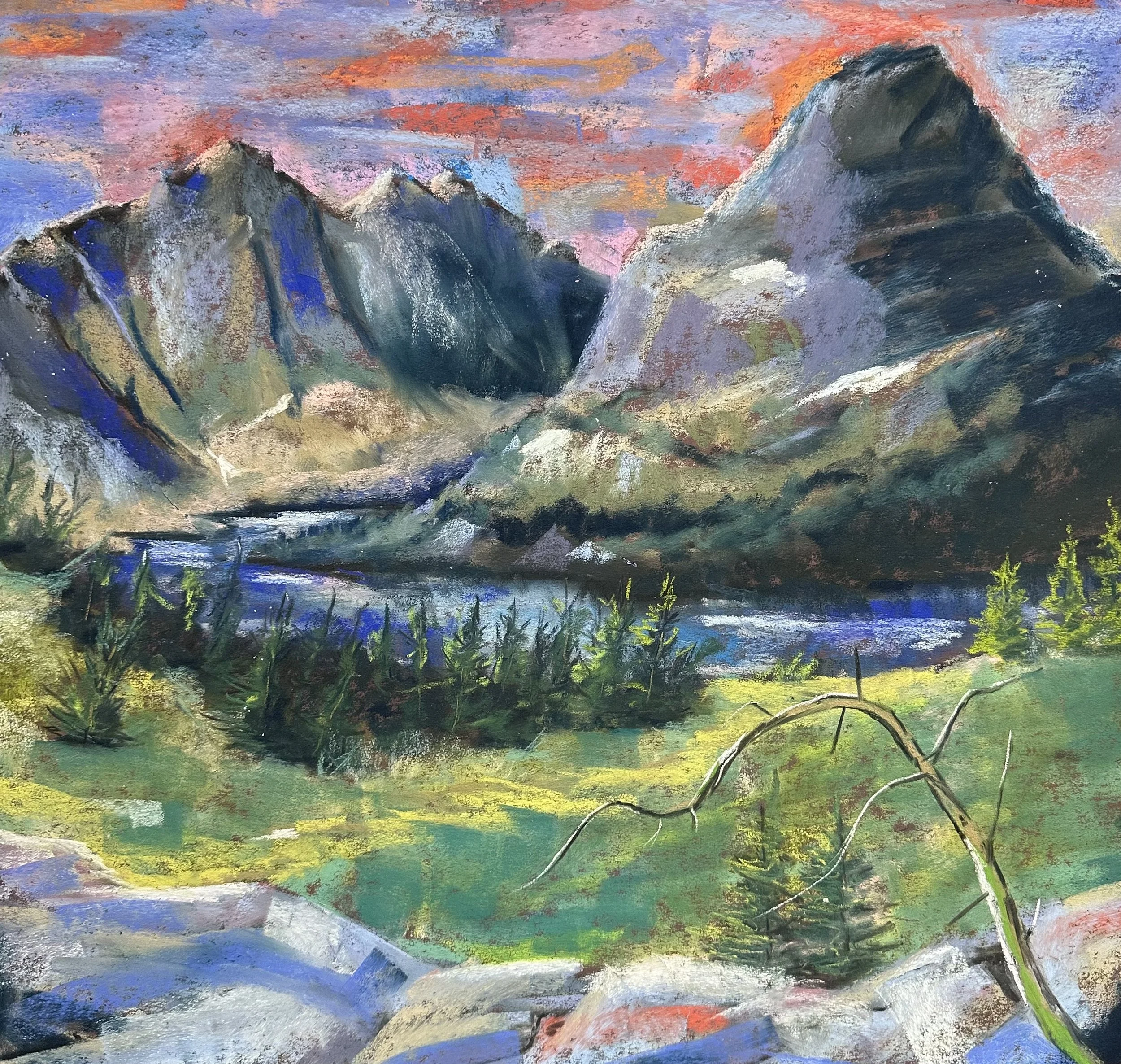
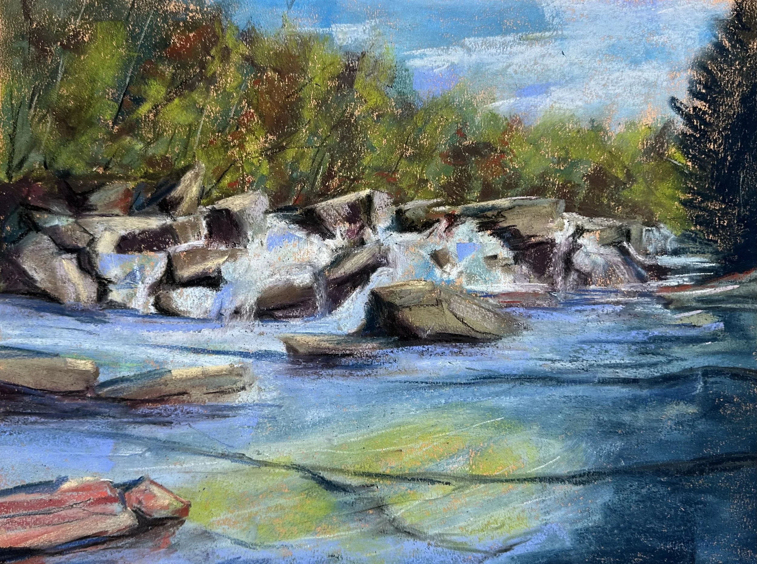
Going to the Sun Road
This is a painting I did from a photo I took when we drove “Going to the Sun Road” this summer.
What am I doing?
I finished my most recent novel and am querying agents, so it’s time to move on to more projects.
I’ve started a comic that I’m not sure if it’ll be a strip or a by-issue type. Currently I am just drawing a lot of the character and figuring him and his world out.
I also started a western that I’m writing for my dad.
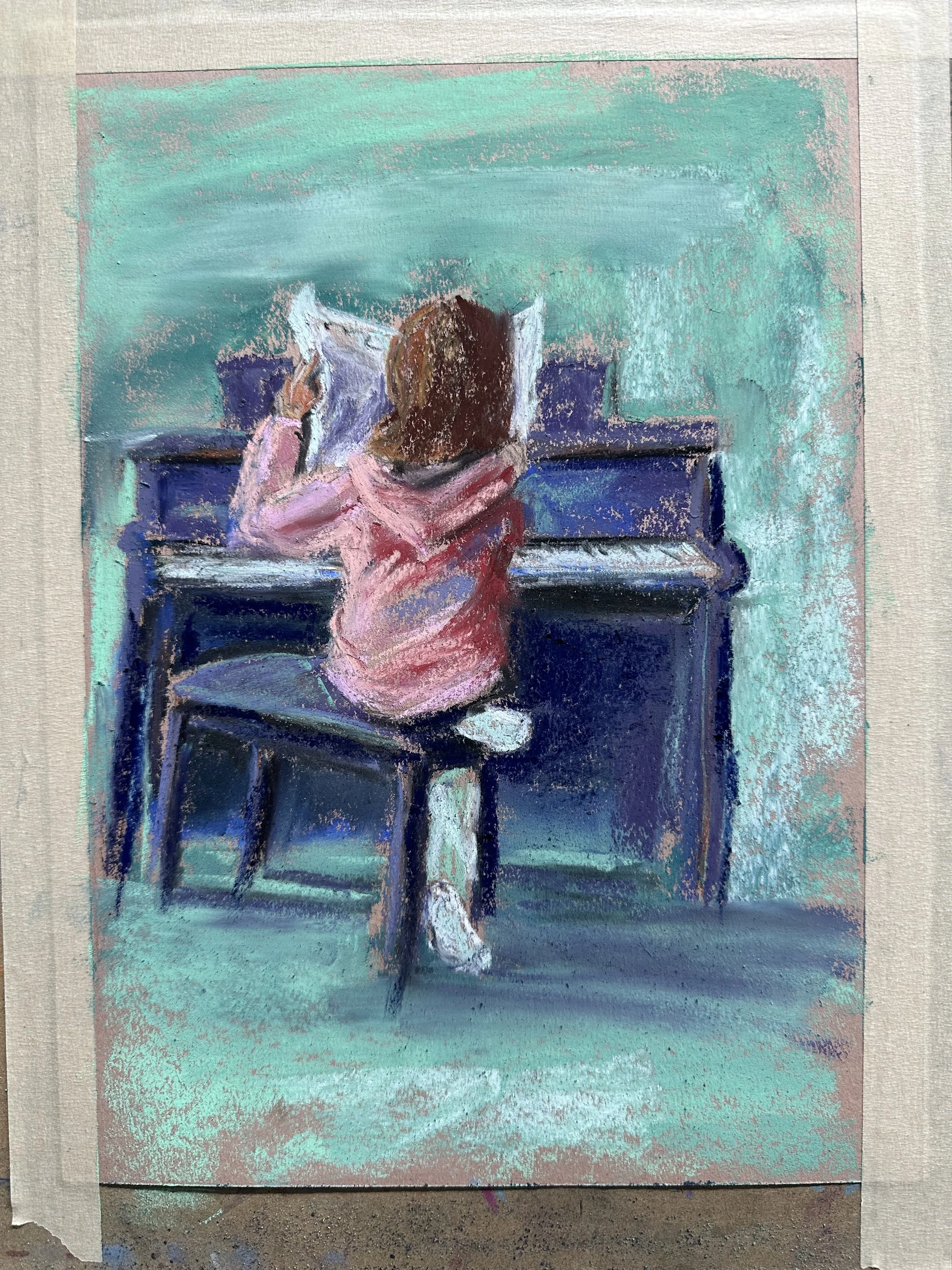
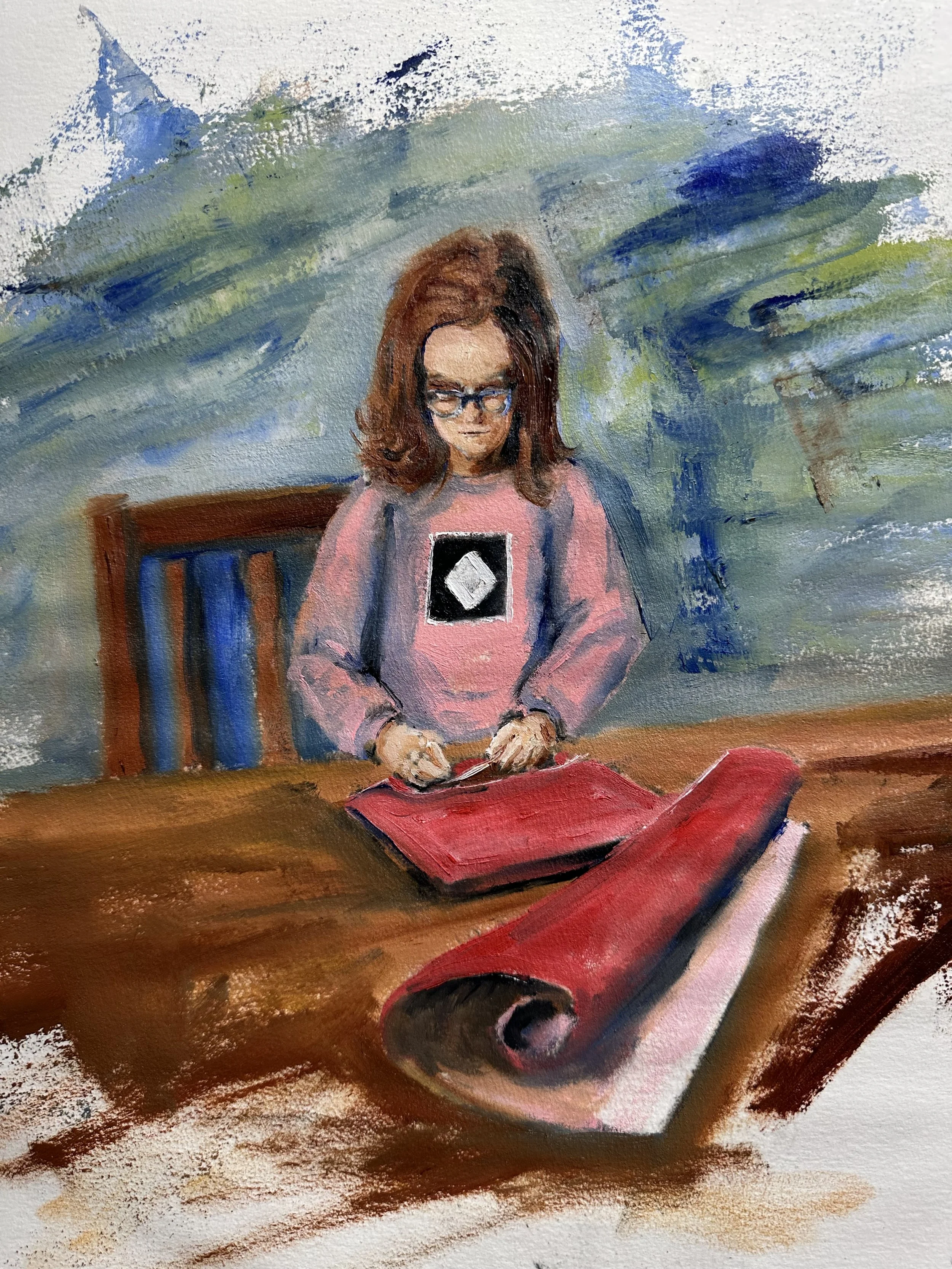
I’m still painting landscapes and portraits. The following is not complete, but it’s of my oldest daughter wrapping her grandma’s bday gifts. I did it in oil because it’s small and I can’t do small things with any detail in pastel, at least not in a way that pleases me.
There’s an update. Huzzah?

Novel Break
I’m taking a few days off from working on the new novel. Going to use that time to focus on more dead tree paintings and portraits. Then I’ll get back to it.