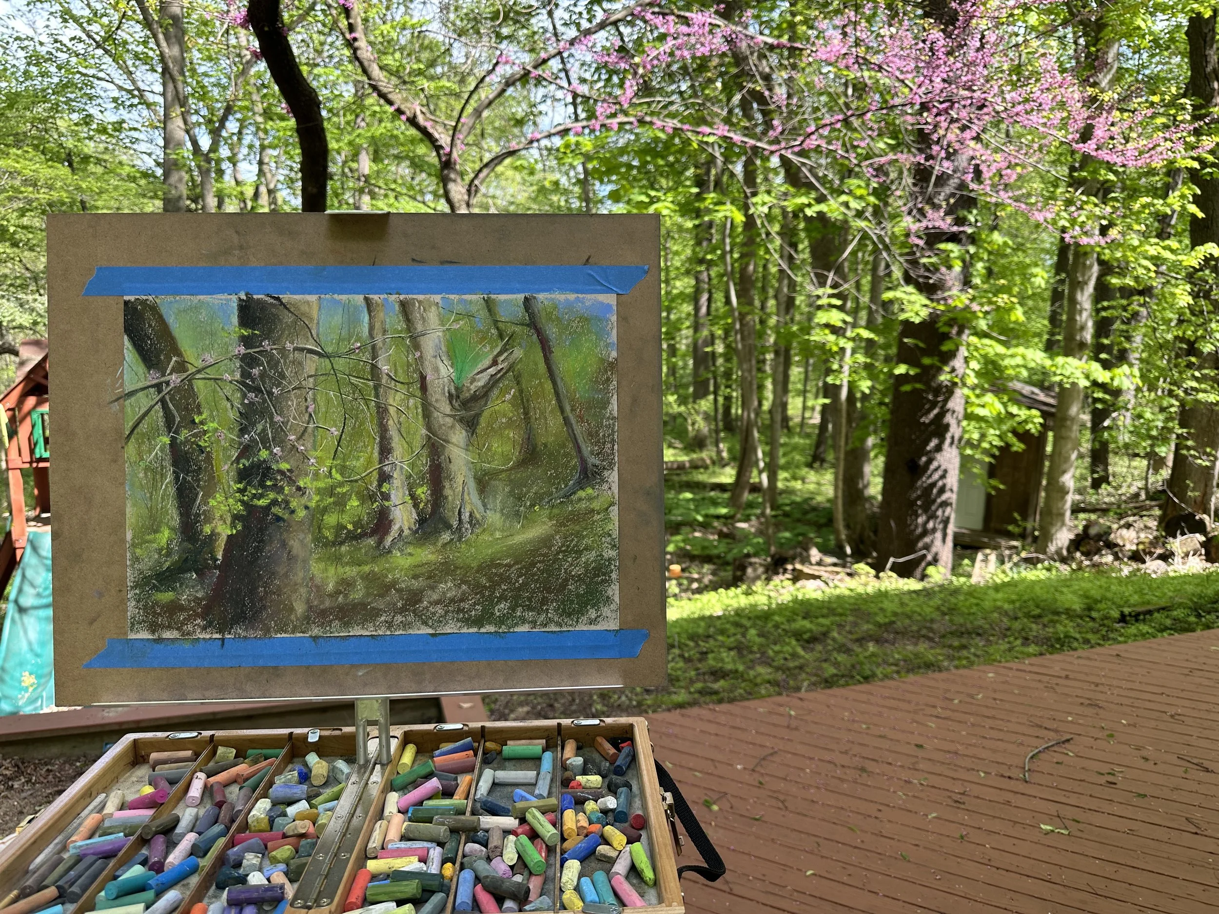
Today’s Pastel Painting
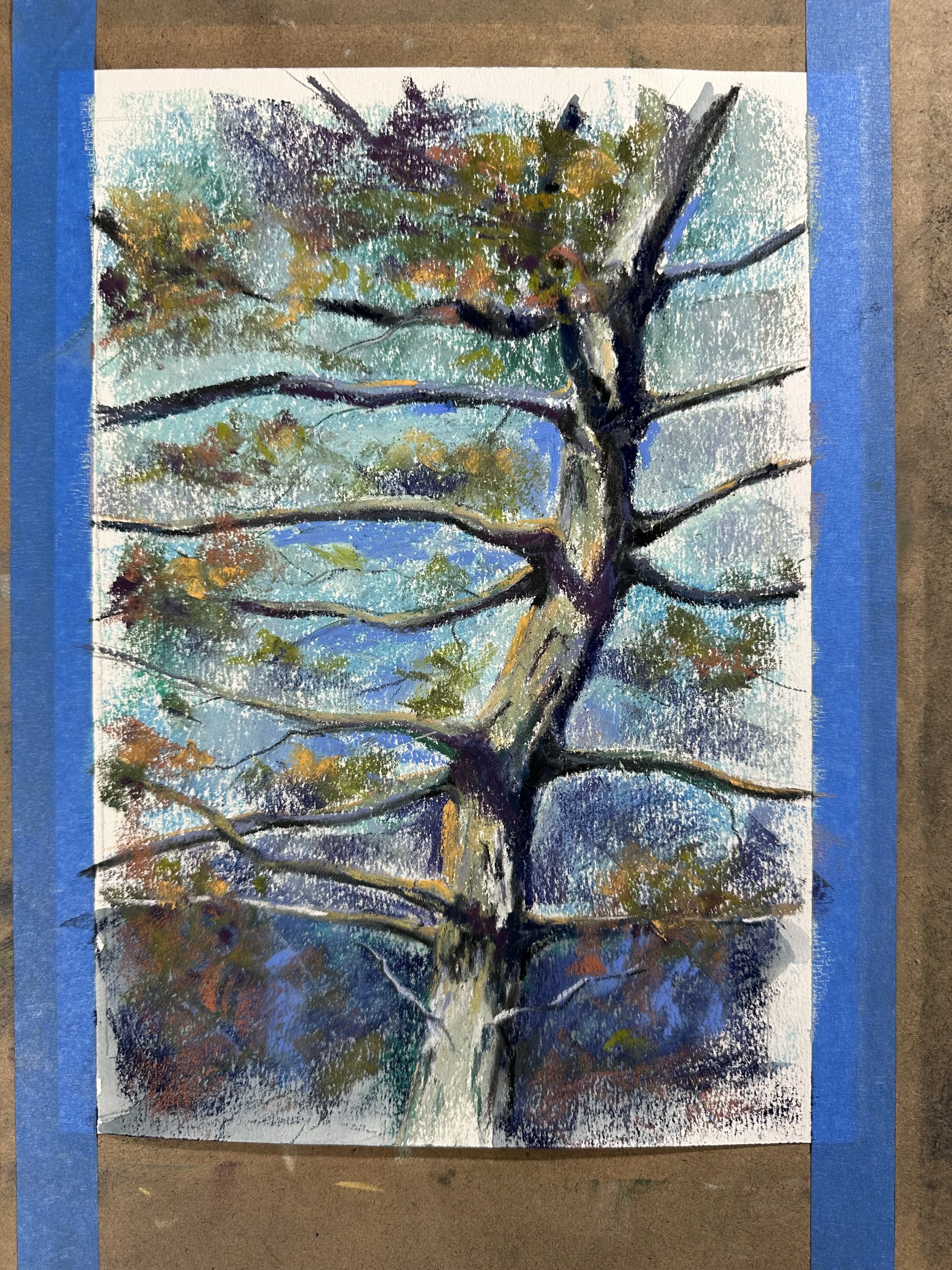
Here is the tree I painted today. I don’t really like working on white paper, but I have it and I didn’t want to tone it so I did it anyway. I like it, mostly.
Paintings, Illustrations, Stories
The Home for Brandon Davis Jennings art and writing.
Here is the tree I painted today. I don’t really like working on white paper, but I have it and I didn’t want to tone it so I did it anyway. I like it, mostly.
I’ve been working on this for a long time, but took a break to focus on landscapes.
This was drawn onto watercolor paper months ago, and then today I added some clear gesso, did a watercolor wash and then painted on top with pastels.
I think these colors work. If I want to do anything with the face I’ll have to do this a lot bigger, and then I’ll probably switch to oil and it’ll be a whole thing.
At least I got it out of my head.
Here is what I worked on this morning. A 9x12 Pastel of a Pine tree in my front yard that always sort of looks like it’s trying to get away from me. I started this on white mi-teintes paper, and I don’t think I will do that unless I have no other other paper to choose from. I don’t mind when the paper bleeds through in some of the paintings but when it is bright white like this and I am trying to get the vibrant green of the pine needles that are catching the sunlight it fights with the green too much. I’ll keep at this one, though. I really like the shape of the tree and the shadows.
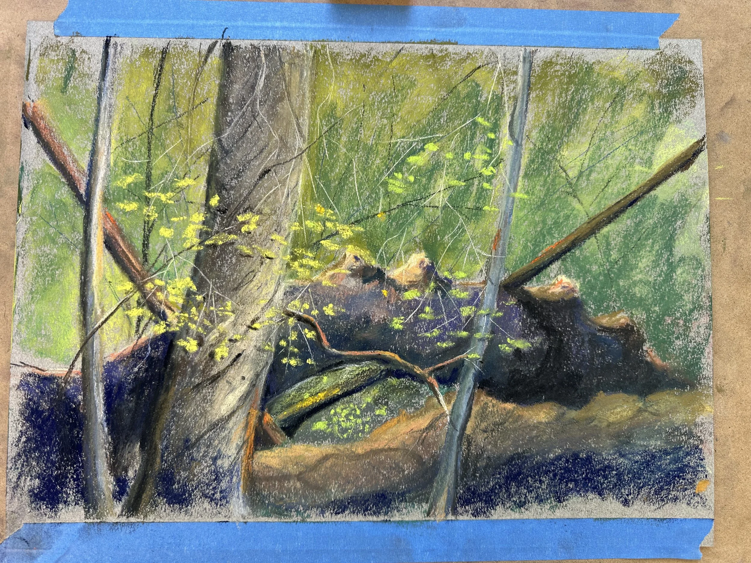
I did this study of a few trees in my backyard this morning. There are times when I walk away from a morning of study and feel pretty good about the end result. This time I mostly feel like I learned a lot from this and, possibly, I’ll scratch at it a bit more in my office later on, but I’m not panning on putting this into any kind of a competition.
I definitely need more stark darks in my plein air setup because I kept trying to find a green that would do the job I needed it to do in the background, but I just couldn’t get there. I wanted the leaves up front that are overlapping the thick upright tree to really pop, but they aren’t getting there for me. It’s all too much in the same value range I think. I do think that this is closer to what I was actually seeing than what I wanted to see and more importantly what I wanted to show people who looked at the painting.
The fallen tree in the background needs to curl up more and then roll away in a more convincing way as well. That, again, will be easier to achieve with some richer darks, and some better drawing of the shape initially. By better drawing I mean inventing a bit more than I did so that I can get the cross contours of the shape to work for me better.
I had some fun with some orange in a few spots that I regret now.
One thing that might end up being the best solution for this is to crop out a large part of outer painting and just try to focus in on the central idea. This is something Cathy McCormick has shown me in the past, and I have nothing to lose so I’ll give it a shot and see if I can find something good inside there that the overall composition has made invisible.
I think this is mostly done. I’ve been trying to find a decent pose of Penelope for the last in a series of portraits that I’ve worked on for my wife over the past six or seven years. They are all 9x12 or smaller, and if I had known how much I prefer to work larger than that I would’ve just started with a larger size and likely experienced a lot fewer headaches.
Fortunately I have thousands of pictures of the girls to choose from these days and that means i have no shortage of potential references. That also makes it challenging at times because a good photograph doesn’t always make a good reference for a painting. In fact, I have come to believe, that the better the photograph is, the less you might have to say about it as a painting.
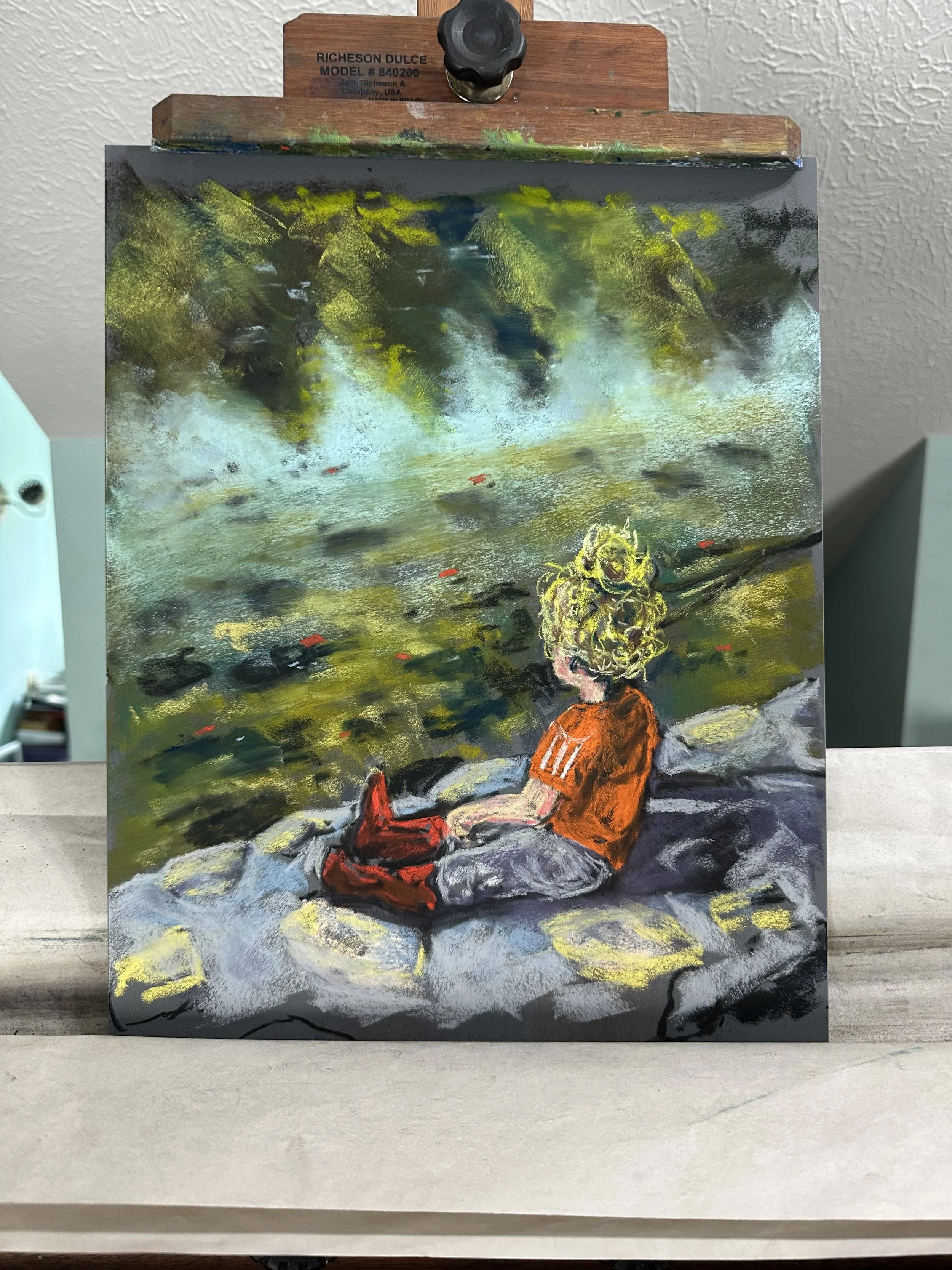
I have no interest in photorealistic painting, so that helps me to eliminate a lot of what I see as extraneous stuff from the compositions when I paint from photo reference. This picture, which is of Penelope on the rock wall looking out at the St Joseph River is more about her emotions and mine at the time of the painting probably than what is there. Her hair is basically an icon at this point, and her choice of clothing (a soccer jersey, some pants and some cowgirl boots), I think helps me to show who she is better than any clothing combination I could have invented on my own.
This photo was taken at the end of summer, and I just added some red and orange in the water to incorporate it into the background so that it wasn’t solely in her clothing. There were no leaves changing color at the time, and I am tempted to get into the tree reflections with some red and orange as well, but I know that really it’s time to move on. Once I move it off the easel I may carry the painting through to the edges at the top and bottom, but in order to frame the painting I will need to mat it, and that would make it pointless unless I glued it to a floating mount or something.
This one was done on Ampersand Pastelmat, and I love the way it takes the pastels, the unison pastels in particular. I think they’ve become my favorite. I really like the variety of Rembrandts in the half-stick set I bought, but as they run out, I’ll replace them all with unisons and keep my nupastels for hard edges when needed.
This is a gift for my wife, so it’s not for sale.
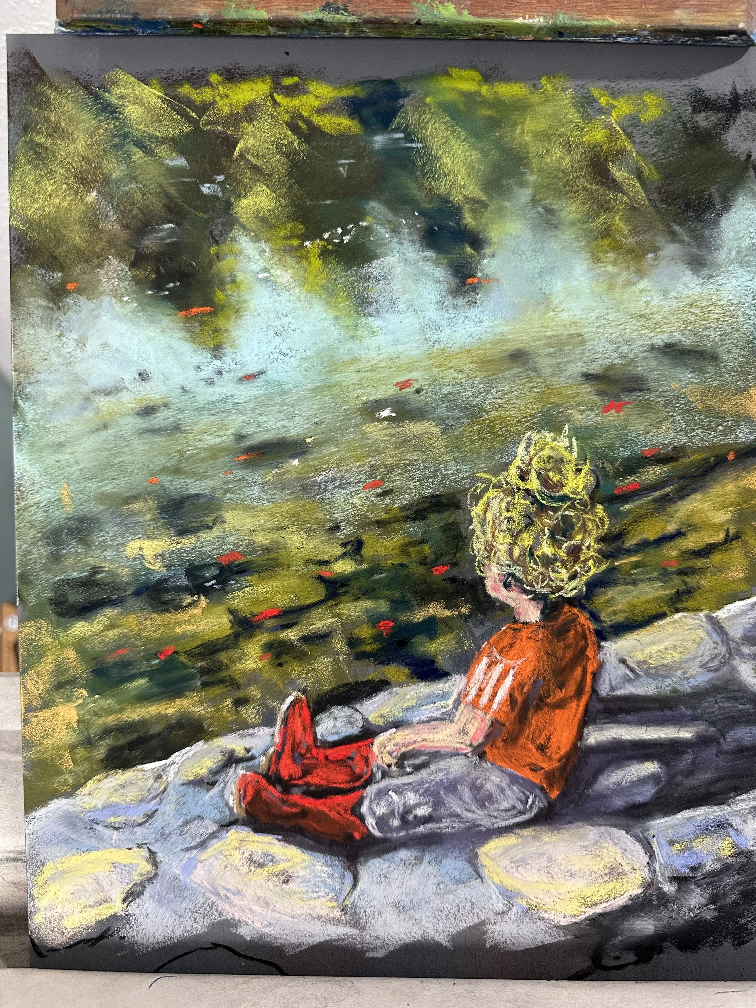
Here is a painting of my youngest daughter sitting on a rock wall beside the St Joseph River in her favorite cowgirl boots. I just wanted to mention that I will accept any donations of unison pastels that people want to send my way.
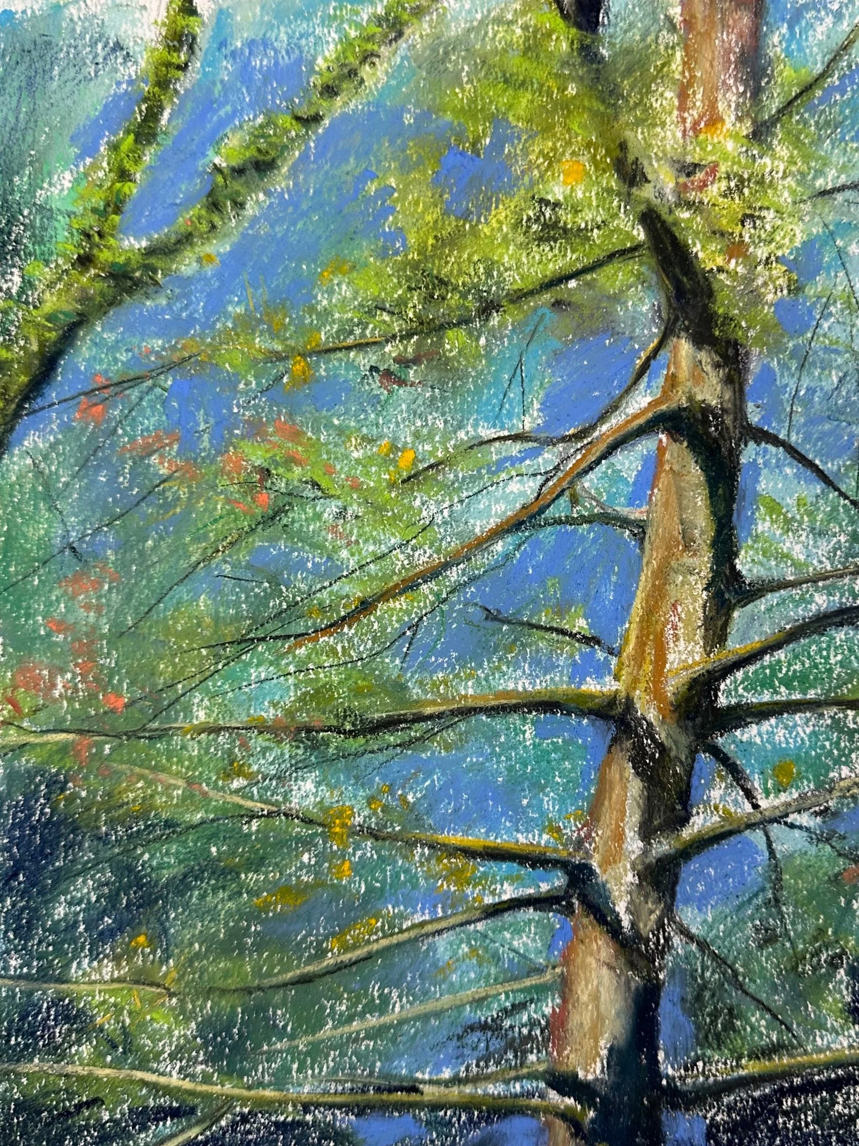
I got outside for a bit this morning and tried to capture some of the spring colors in my backyard.
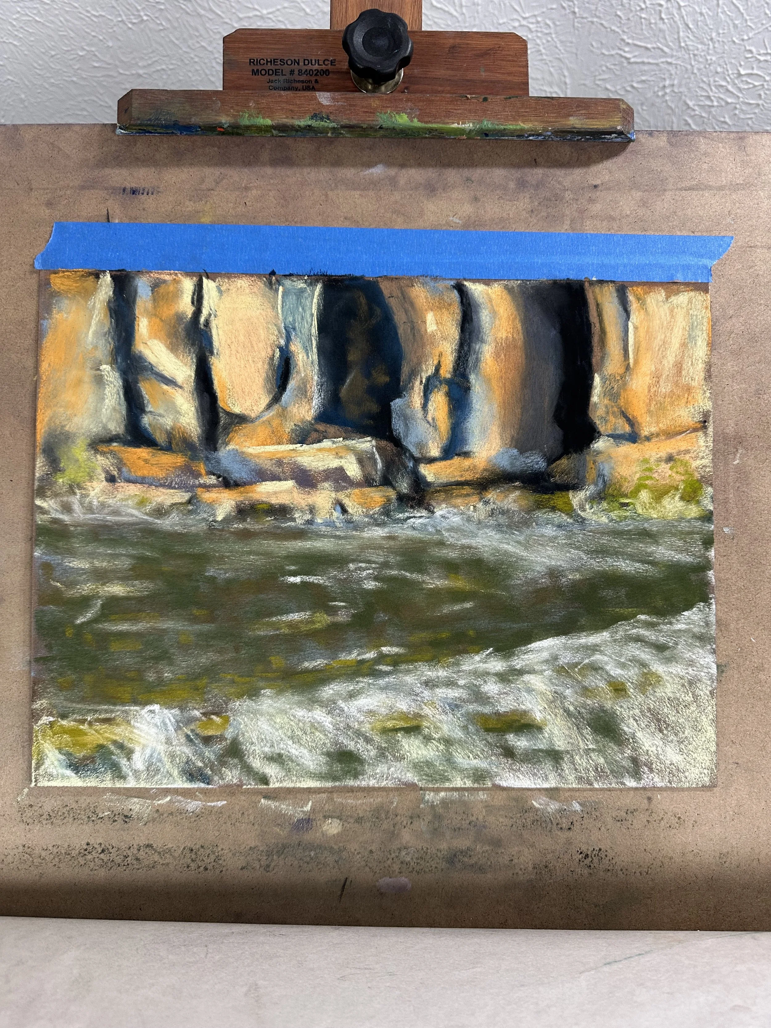
I finished up my 14x16 of the Yellowstone River today. It’s pastel on paper.
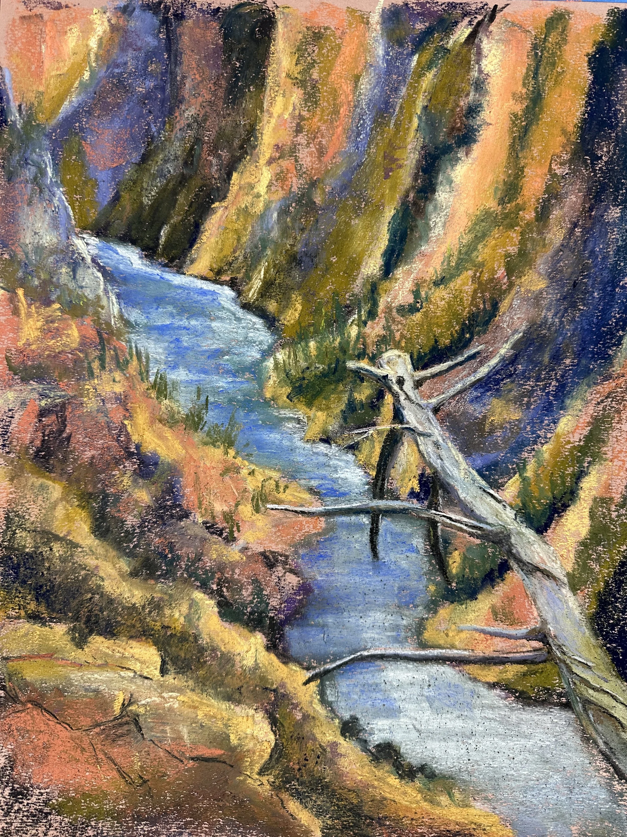
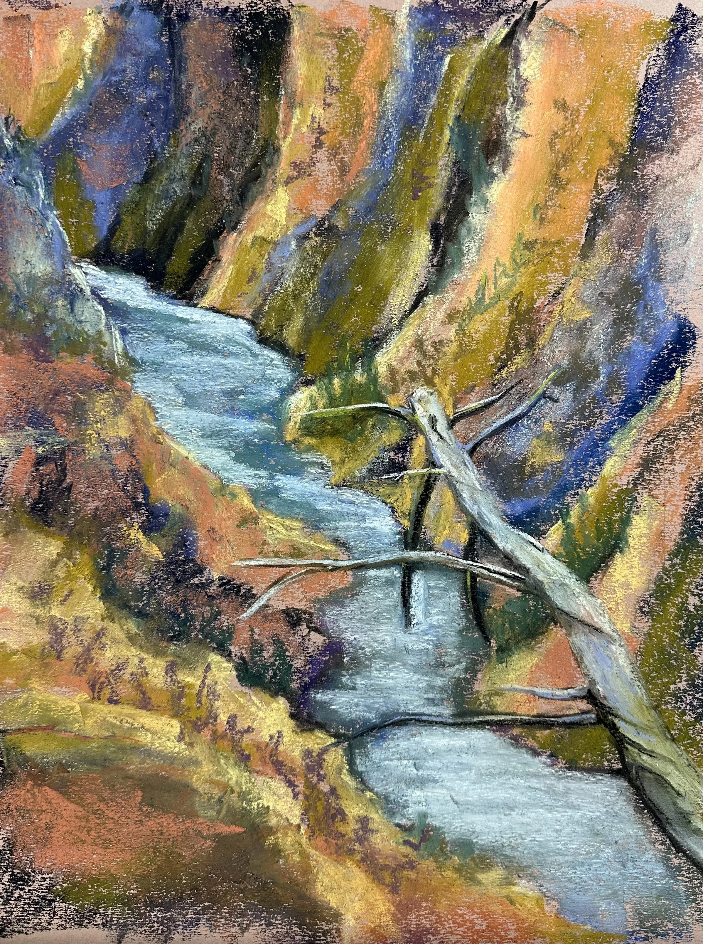
This is what I am working on today. It’s a pastel painting of the Yellowstone River.
Here is what I’m working on today.
I’m still not sure what to title this one. I’ll figure it out later. Otherwise I may not paint anything else today.

Untitled painting inspired by Handle’s “Reflections”. 9x12 pastel on paper. Prince $220 not including shipping or framing.
I have been pretty busy for the past four months or so. Many of the things I had hoped to accomplish last year fell away as kids got sick or I got sick or when new and more important goals cropped up. But despite all the ugly parts of the winter, we all made it through, and it’s been mostly good. I’ve been doing a lot of soft pastel paintings, and have once again opened up my novel and began weeding through it so that I can send it out to agents in the fall. I’ll be posting my art work here, and I will be talking about what I am doing here. I’m hoping to do it weekly, but the website is less important to me than the work, so it’s likely that most of what I write here will be brief.
Here is the pastel painting I started last night. It’s inspired by an Albert Handell painting called “Reflections”, and you can see it in his book Painting the Landscape in Pastel on pg 102.
Here is my painting in its most recent form. Until I finish it, I won’t give it a title.

All the work that I post in my galleries will be for sale from now on. I’ll mention this a few more times going forward, but the information is all on the homepage for my website. All work is priced at 2 dollars per square inch. Commissions are 3 dollars per square inch. That will never include shipping or framing and matting.
I am happy to say that one of my paintings, “Dancing Beech” will be at the MAAC show in St. Joseph Michigan at the Box Factory for the Arts this year. I’m grateful for all the help I’ve received from Cathy McCormick, and all the people at the Northern Indiana Pastel Society (to which I am now a member). I also want to thank Katie Neece and Violet Hayden at the South Bend Museum of Art for always answering questions and helping me find books and resources and being encouraging.
I’ve included the digital postcard below and made it into a link that will send you to the website with the list of other artists whose work was selected.

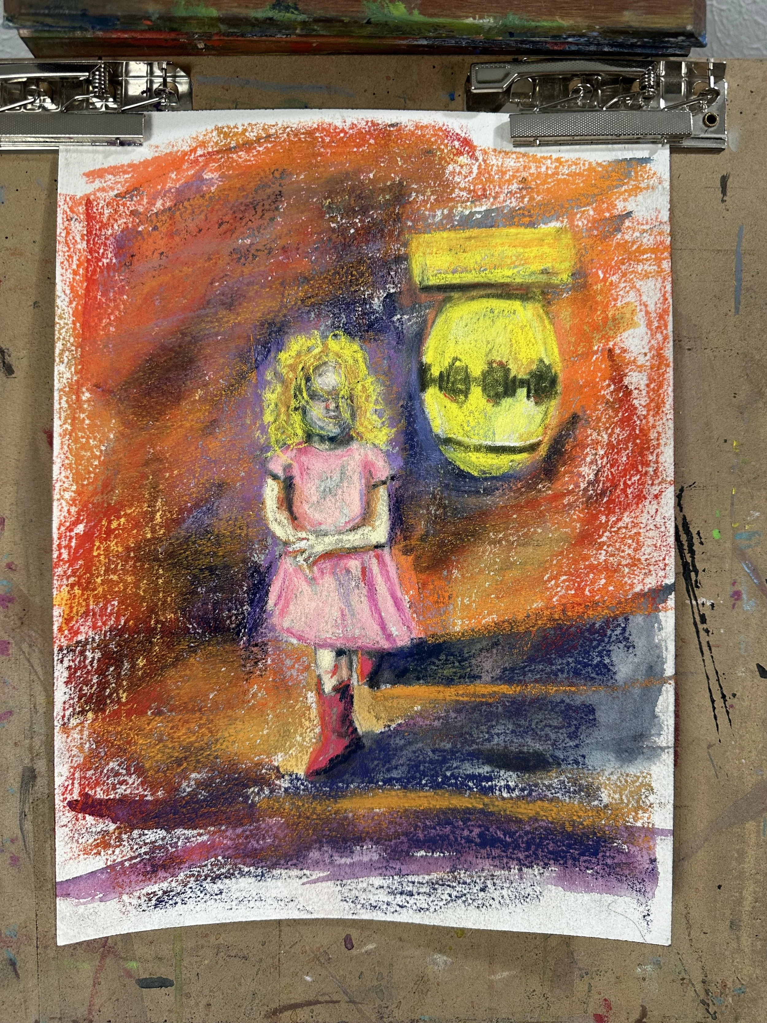
I started work on a painting of my youngest daughter. It’ll be a Christmas present for my wife. I’d worry she’d see it, but she doesn’t have time to read my blog. Here is the first day’s work of painting. I did the charcoal drawing months ago and then so much stuff got in the way that I lost track of it. It felt good to get a lot of it blocked in this morning after a good session of work on another one of my War Baby paintings.


This painting is “A Day at the Park With Bombs.” I’ll be dropping it off at the South Bend Museum of Art this afternoon for the student and faculty show that runs from November 30th 2024 until January 5 of 2025. There will be be a lot of other work there done by folks in the community, so if you are looking for something to do on one of the many gray days ahead, then go check out my work and all the other work that will be on display in the Jerome J. Crowley Community Gallery at SBMA.
I know that as a child when I saw pictures of art I often wondered what the point in going to see the paintings in person was. I’d already seen it, after all. But this painting is 30 inches by 40 inches, and seeing it on a phone or computer screen is not at all the same.
I hope everyone out there is gearing up for a nice holiday. I’m very excited to have my family in town. I can’t remember the last time I had Thanksgiving with my brother and parents at the same time.
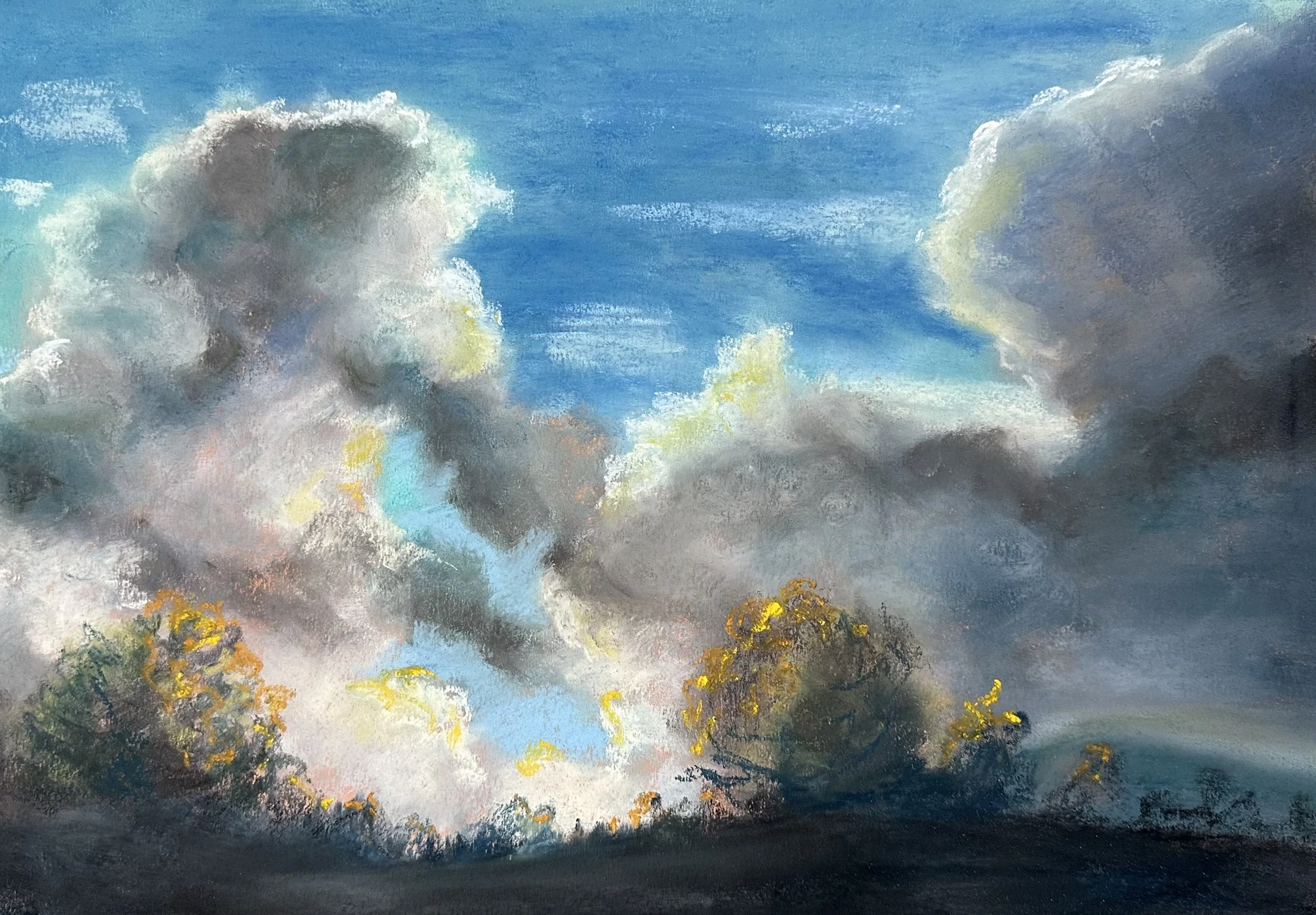
This pastel painting was based on a cloudscape that I saw on our trip to Big Sky this past summer. We weren’t there in the fall, but I wanted some fall colors in the painting, and I added those to the trees in the dark foreground.
Finally I am getting back to work on a bigger painting that I started last year. It’s some kids playing at a park where a giant naval mine has been left behind. The game the kids are playing is collecting and stacking UXOs (Unexploded Ordinance). I know it’s not going to fix anything, but these are the things in my head and if I don’t get them onto the canvas then they just sit in my head and stop me from being able to focus on being alive in the moment.
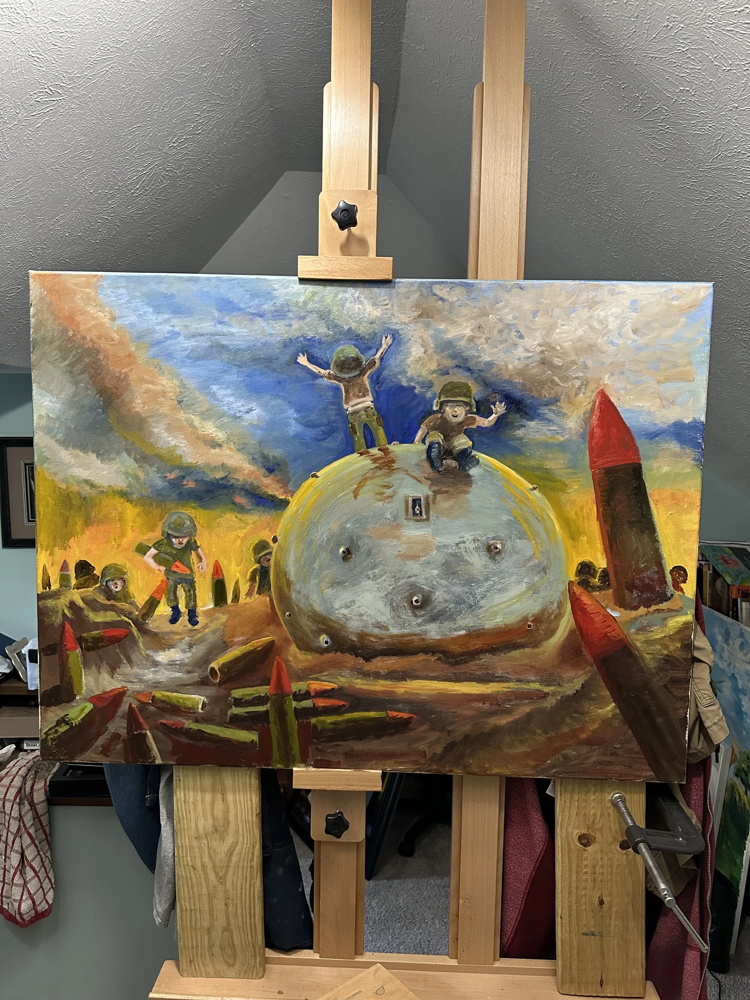
The South Bend Museum of Art is having its annual student and faculty show, and the deadline is Nov 1st. So I am hopeful that I can get this thing cleaned up and finished before that deadline. The deadline has lit a fire, and this will make it so I can get the thing off my large easel and out of my office so that I have room to work on some of the other things I’ve started and not been able to finish.

Soft pastels on paper. 18x24
This is a pastel painting of a West Virginia sunset .

I’ve not written seriously in years; what I guess that means is I haven’t written about things I take “seriously”. I’ve written and illustrated some books for my kids and done some cartoons for them too. But writing the kinds of essays and stories I wrote in the past stopped shortly after my second daughter was born. I have recently been motivated to think about things that I’d shelved due to a lack of time and energy. An unfinished novel that was supposed to be the big finish to the story of the characters in my books, Waiting for the Enemy, Battle Rattle, and High Desert Rats is just sitting under my desk. I frequently bump the folder the novel is stored in with my left foot while working at my computer. Yes it is just a coincidence, Hugh Martin. If I had put it into my filing cabinet then I may never have thought about it again. But I didn’t file it away, and I like to think about connections like this because they help me to maintain some hope that the world isn’t ruled by pure chaos.
In order to get back into the right head space to work on that novel, I need to reread my other books. The thought of doing so is not thrilling. I didn’t write them to read them myself, after all. But to do a good job I had to read them countless times when I was working on them. So the rereading needs to get done, and I will do it. But when I picked up Battle Rattle I realized something that I hadn’t been equipped to notice in the past. The cover is a cropped and photoshopped version of a painting done by Tom Lea.
I am a painter as well as a writer now, and because of that I spend a little time each week looking at art books to see what other artists have done in the past. This allows me opportunities to study the works that I really like, and to learn about artists other than the few who were discussed in my time in school. I wasn’t an art history major so I didn’t get much more than a “greatest hits” of artists; as a result, I didn’t even really think making art was something that more than about 10 people had ever done well enough for the world to remember them. I’d name them, but you already know the names because most of them are Ninja Turtles.
While at the library I grabbed a book called Art of War: Eyewitness U.S. Combat Art From the Revolution Through the Twentieth Century. This book was a random selection, but one that makes sense because I am working on a couple painting projects that deal with the military. As I read through the book, I saw a painting of a man staring into the eyes of the viewer. He wore a combat helmet, and there was a highlight that slashed across the front of the helmet from left to right at an upward angle that I recognized immediately from the cover of my own book.
This was jarring because I expected that Amazon would’ve paid someone to make a new cover for the book when they published it as a Kindle Single. I think they might have paid someone to do the cover, and I think that, maybe, the person who did it altered the image enough so that he or she believed it was different enough to be “new.” But when I saw it, and then saw that I had missed this great opportunity to learn about an artist who wrote books and painted, much like I am doing now, it made me a little disappointed.
Tom Lea died in 2001. So he was not around to be part of a discussion about the use of his painting as a book cover. I would like to think he’d be okay with it, but I’ll never know. I didn’t know him or his art prior to this discovery. But now I know his work, and I am glad that I came across it. I read a book of his The Brave Bulls. It’s a novel about bullfighting in Mexico. I thought the book was fine. It seemed to be written in a way that would look good as a movie or something. I don’t know how else to describe it. I like his paintings more than I like his writing, and that’s just fine.
What matters more to me is that Tom Lea was a writer and an artist who was capable of doing these two things that I am currently pursuing as a career, and he did them well enough to have a career and life built around making art in multiple forms.
Lea was with the 1st Marine Division at Peleleliu, and for anyone who has seen The Pacific or read With the Old Breed or Helmet for My Pillow, then you’ll know how deadly it was for the marines and the Japanese who fought there. Lea was there as an artist while the fighting happened. I assume, because I haven’t read anything to contradict it, that he did not storm the beach with the marines, but it was, by all accounts, an ugly and horrible place to be during the time he was there. So he wasn’t a soldier in the war, but he was an artist who was there while it was happening, and that is pretty amazing; I can’t believe they let him do it. The only thing I can think of that is similar (I’m sure there are a lot of examples of other artists doing this that I’ve not heard of) is MIchael Herr and his book Dispatches about the Vietnam War. There is something about occupying that particular space that fascinates me.
Part of me is angry that his painting was used in this way, by Amazon, to put a cover on my book, and part of me is glad because had it not been used I don’t know that I’d have been pushed to learn more about Tom Lea. I could email the artist who did the cover to see what his rationale was, or if he was told to use that image by Amazon. But I guess there is not much good that could come from that anyway. It’s not like I (or Tom Lea’s estate) are seeking some kind of monetary settlement. I just wish they’d credited him at least because then I could have looked more into Lea’s art and writing without having just stumbled upon it by coincidence when I was in my local library.
But to keep this short for the time being, I want to just end by saying that if you are at all interested in Tom Lea’s work, then just give it a quick google. He has a lot of stuff that is not war related, but that, of course, is what I am most interested in.
My mri showed, from what I understand, no concerns. So that means I don’t need to sit around fearing inevitable blindness. So hopefully I will be able to let it go, and focus my energy on finishing the book for my youngest daughter over the course of this fragmented week, and then get back to work on A Sick Child. There is also a student and faculty art contest at the South Bend Museum of Art that I want to have something new for, and although I’ve been able to work on some things over the past three months, I’m not sure I have anything that I want to enter in a contest.
I’m taking a pastel landscapes class with Cathy McCormick (and this is my first in-person, guided with assignments class that I’ve taken in art ever.) Her instruction has been invaluable. I don’t think that I’ll ever choose pastels as my first choice, but I’m definitely impressed with what they can do.


These are three paintings I’ve done since the start of the class. What I like most about the medium is that it is close to the same as drawing with vine charcoal, and there is actually vine charcoal in the darkest parts of all these. It allows me to work pretty loose and that forces me to stay away from fine details that will do little to improve the painting. I’ve got some larger canvases that I’m hoping to work with later to do some landscapes based on some of our trips over the past years so that we can cover up some of these imperfections in the paint in our house…I mean to make the walls look less bare.


This last one was done on the “chicken wire” side of the paper. It has more bite than the back side of the paper, and Cathy warned me not to use it, she warned all of us not to use it, but I did it anyway, and I immediately regretted it.